


Great news for indie authors: according to APA, audiobook sales grew by 12% in 2020. Readers chose audio more often for its convenience and relaxing quality. So, it’s about time to diversify your portfolio with an audio format and tap into new audiences.
But, to sell more, you need an audiobook cover that will attract attention and stand out on mobile devices. For some writers, it may seem like a deceptively simple task as they already have nice ebook or print book covers. But, there are hidden nuances you should consider to design a nice audiobook art.
To help you, we’ve compiled our tips and examples of effective audiobook cover design.
How does an audiobook cover differ from a traditional cover?
On the surface level, an audiobook cover differs from an ebook cover in dimensions.
- Traditional covers are rectangles
- Audiobook covers are squares
It’s a deceptively simple answer behind which there’s a world of difference. Audiobooks cover dimension change all the essentials of good cover design, such as
- preferred composition approach,
- amount of detail,
- accents,
- contrasts.
Besides, audiobooks are usually browsed on mobile devices, which gives all the nuanced audio cover design requirements even more weight.
Considering the differences between the book cover formats, we suggest the following audiobook cover tips:
Audiobook Cover Tips
Audiobook Cover Composition & Art
What’s the difference between a rectangle and a square? Well, the common answer is that all sides of a square are equal. But, we’re leaning towards a design-oriented answer: squares and rectangles lend themselves better to different types of compositions.
Despite how counterintuitive it may sound, with rectangles, you have more space to work with. In general, you have three potential focal points on a rectangle: the top third, the bottom third, and the middle.
It means you can play around with art and typography layouts. You can even divide a rectangular cover into three separate parts to jam in as much visual storytelling as possible.
On the other hand, with squares, our eyes struggle to escape the magnetism of its center. As follows, audiobook covers prefer art with the main object at or near the center of the audiobook cover.

Of course, such a composition isn’t an unbreakable rule. You can play around with it. But to ensure that the readers won’t be confused, you need something to balance the cover against its middle axis.
For example,

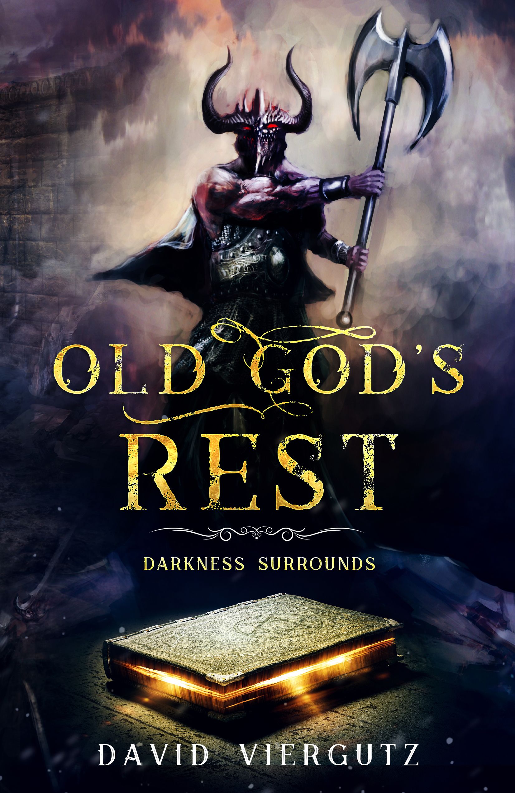
The gravitas of the Haunting of the Sunshine House cover is the woman on the right. It skewers the ‘mass center’ of the cover a bit. To make it more balanced, we placed the title and author’s name to the left of the character. As a result, it’s easier to parse the cover.
Audiobook Cover Details
You don’t want to oversaturate an audiobook cover with detail (unless that’s your vision). It will look cluttered, and readers will struggle to discern the imagery.
On the contrary, keep audiobook covers simple. It means
- create art with a single or a couple of main characters,
- stick to simple backgrounds,
- ensure that poses, action, or background of the art are intuitive to a viewer,
- try to keep the overall digitalization of the characters to a minimum or ensure sharp contrasts.
If you do everything right, the audiobook cover will look well on a mobile device and attract attention.


Audiobook Cover Accents and Contrasts
The best audiobook cover designs have sharp contrasts and well-defined accents. All in all, a book cover designer can create contrasts by
- The difference in colors,
- The difference in shapes,
- The difference in size;
- The difference in the amount of detail (a tricky one).
Red elements against a black background will stand out; a triangle against a circular background will stand out; a small figure against a giant city silhouette will stand out too. Finally, you can achieve contrasts without the first three by playing with the digitalization of different elements.
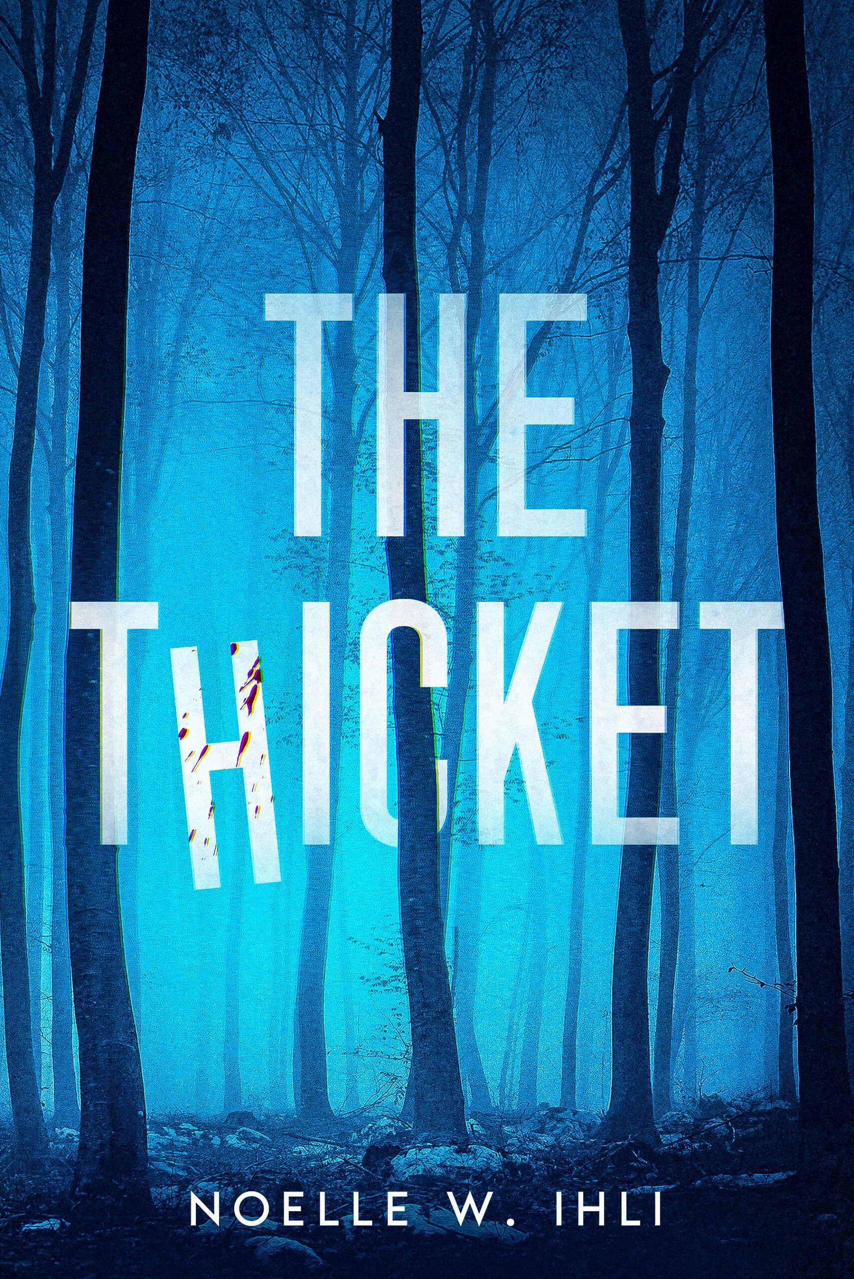
For example, take a look at this cover.

The girl stands out against the background not because of colors or difference in shapes, but because she’s detailed and feels real, while the background is abstract and simple. To pull this approach convincingly you need strong design proficiency and a good eye.
Overall, you have to determine the primary focal point of the audiobook cover art and accentuate it with proper contrasts. The simplest and safest approach is to create contrasts by еру differences in colors. However, in this case, you need to pick matching colors carefully. The primary color should convey the mood of your work, while complementary colors contrast it.
We suggest using the color circle for this task. Generally, you have three approaches:

The first and the third ones are the best for sharp contrasts.
Now, how exactly you want to use the power of contrasts is completely up to you. Perhaps, you want to accentuate the title, then make it the brightest, the most angular, or the biggest part of the cover art.

Or maybe you want a character to be the main cherry on top of your design. Then, you can make them stand out against a darker background with colorwork and attention to detail.

Here, the character is much brighter and “crisper” because of the detailed illustration and dominating presence.
Audiobook Cover Typography
Typography can make or break an audiobook cover design. Fortunately, nailing typography isn’t rocket science.
All the usual typography advice applies:
- Pick a font that suits your genre and vibe of the cover,
- Make sure the text is big enough and legible,
- Apply to the text required spacing, textures, and colors if needed.
Besides that, you should pick a proper place for typography on your audiobook cover. It’s also easy — it’s either a center, bottom, or top of the cover, depending on the art. In some rare cases, you can move the title to the side of the design, but only if the cover art demands it (like the aforementioned cover for the Haunting of the Sunshine House).


You can read more about book cover typography here.
Can you use a modified book cover as an audiobook cover?
It depends. If your book cover art follows the tips we described, then sure you can use it for an audiobook cover. Just make sure to move typography properly and cut the art without harming its storytelling. You should determine which parts of the visuals you can leave behind and which are essential to the cover.
Otherwise, if your book cover is too detailed, has a complex composition with several focal points, or has lacking contrasts, it’s better to
- redo the cover by trimming it down and ramping up contrasts,
- create a completely new one from scratch.
For example, this cover may translate to an audiobook format fairly well without much work.
While this one, won’t.

You either need to shrink the silhouette so everything fits into a square without distortions, which will harm the art’s impact. Or you can put the title on top of the art, which will obstruct the visuals. In any case, the designer will need to spend some time to figure out the nuances.
In any case, don’t risk the online visibility of your audiobook by leaving an art that won’t translate well to a new format. Besides, a professional audiobook cover design can cost you $25, including a month of free unlimited revisions and help with ideas.
Summing Up
The pace of life can be unrelenting. It’s difficult to find free time to squeeze in reading. An audiobook is a convenient solution to this issue. No wonder that 1 in 5 Americans are listening to audiobooks now. If you want to get new readers, audio format is the way to go. Besides, it doesn’t require much investment as you can hire a freelancer or record an audiobook yourself.
And finally, a proper cover can help sell your future audiobook better. Such a cover will have sharp contrasts, proper accents, the composition that works for square formats on mobile devices, and catchy art. If you need help with creating an effective audiobook cover design, feel free to contact us.


