


“I just wish each best book cover idea was in one place — no endless scrolling, just pure inspiration.”
We hear you!
In this post, we’ve gathered 20 creative and eye-catching book cover design ideas to spark your imagination, whether you’re writing romance, fantasy, poetry, or thrillers. No more guesswork. Just scroll through, find what speaks to you, and get inspired before you book your professional designer.
Let’s dive in!
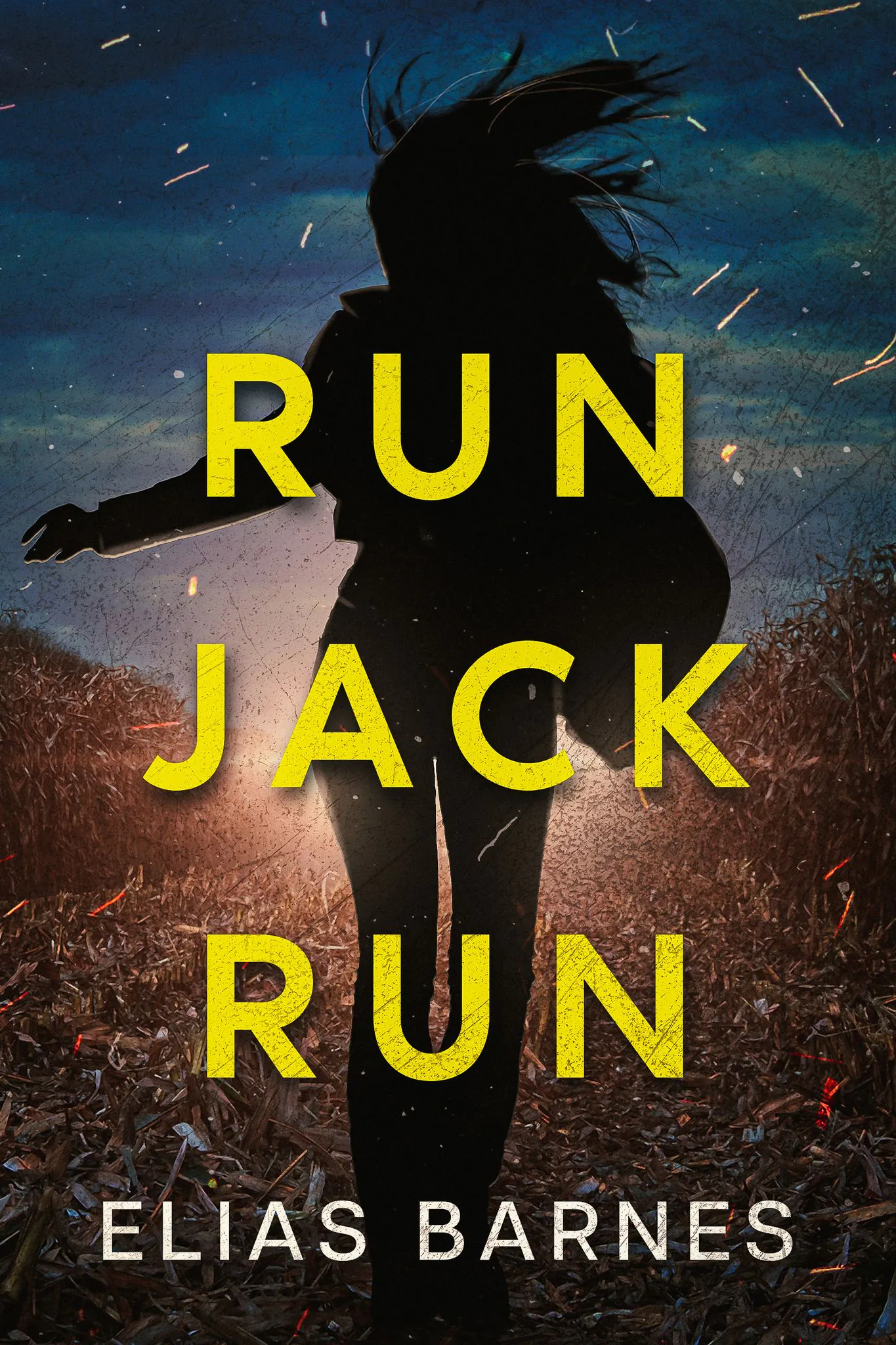
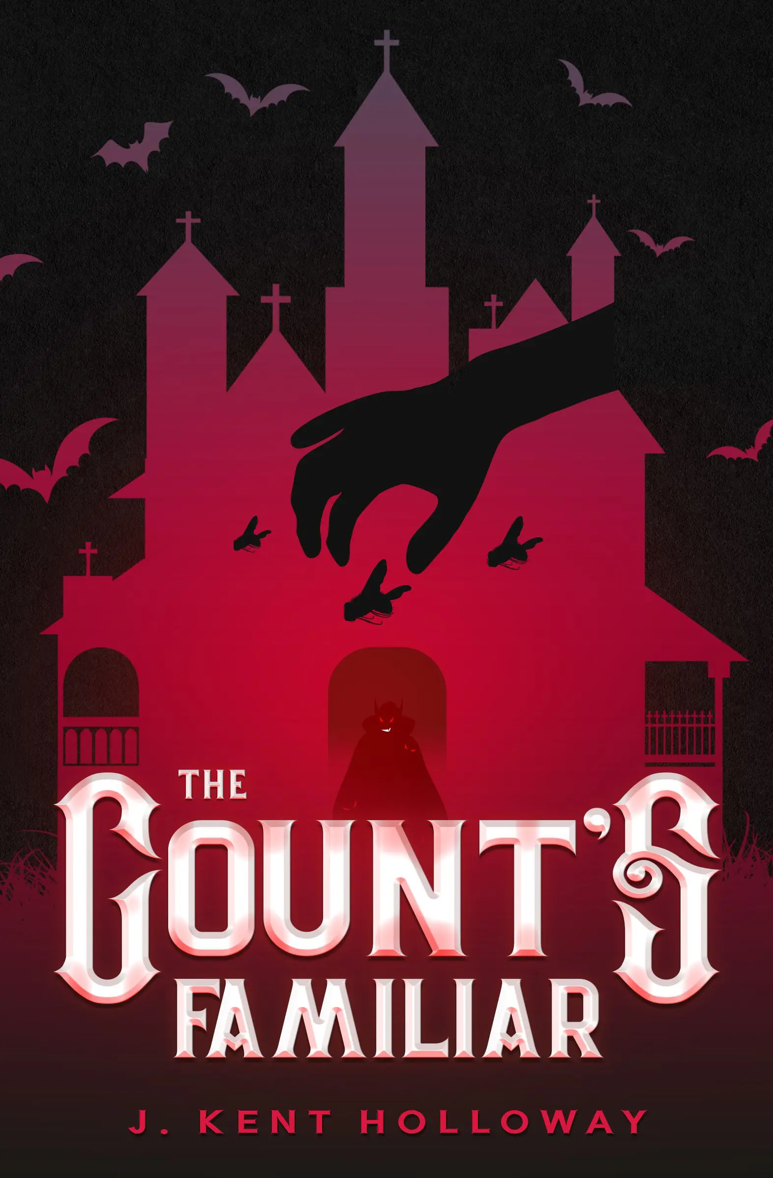
Idea #1. Intriguing silhouettes on the book cover
Silhouettes are a great way to add mystery. They hide details and leave a lot to the imagination. That’s why they work so well for thrillers, fantasy, and mystery stories. A dark figure against a glowing background makes you wonder — who are they? What are they hiding?
Covers like this make people curious. They pull readers in because they want to know more. Plus, since faces aren’t shown, readers can picture the characters however they like.
 |
 |
 |
| Getcovers | Getcovers | Source |
Idea #2. Fascinating double exposure
Double exposure is when two images blend into one. Maybe it’s a face with a forest inside it. Or a city skyline within someone’s silhouette. It looks cool and tells a story at the same time. You can show a character’s inner world, fears, or what they’re fighting against. And even with lots of detail, it doesn’t feel messy. These covers feel deep and artistic. They suit pretty much any genre.
 |
 |
 |
| Getcovers | Source | Getcovers |
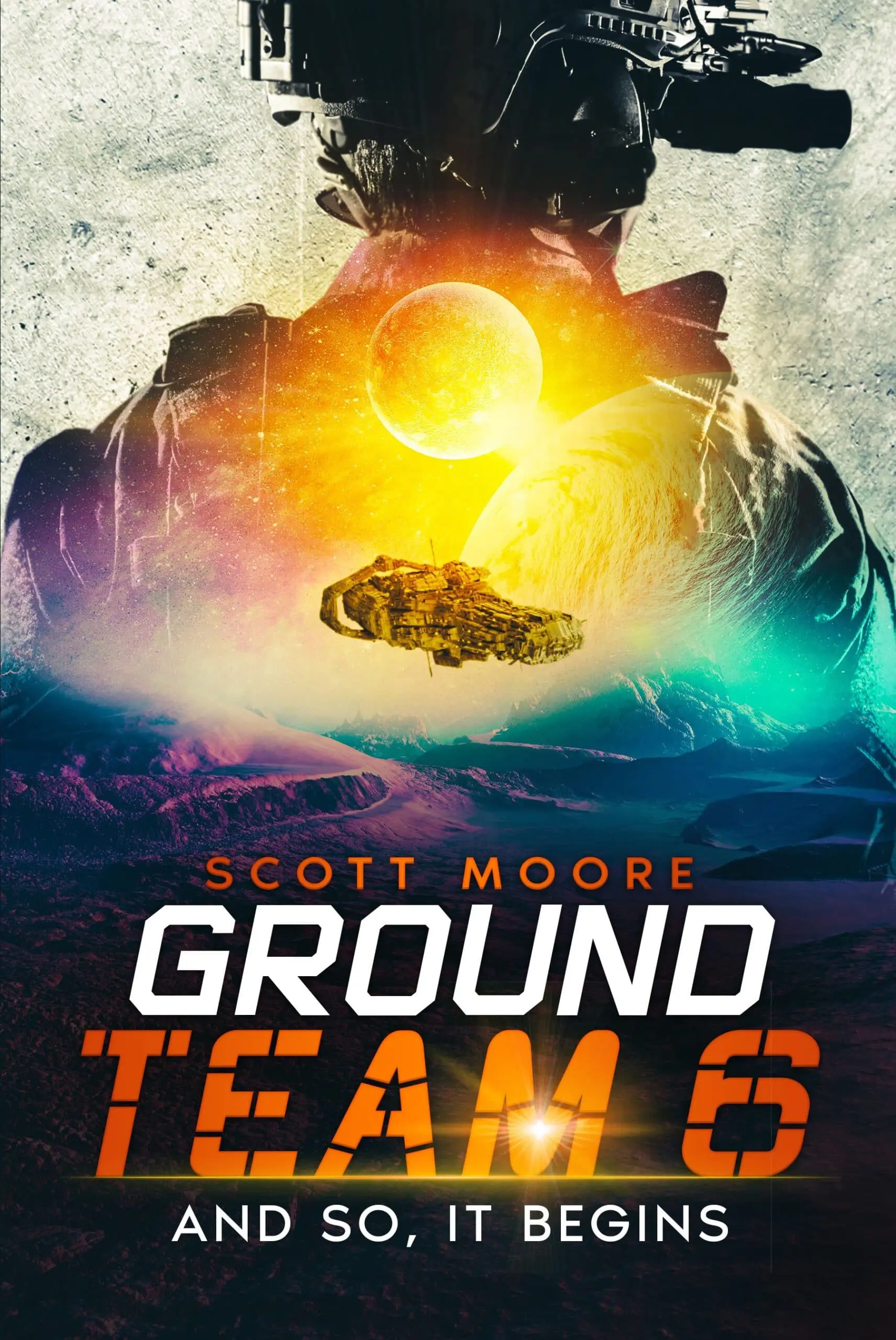
Idea #3. Bright vector illustration
Big colors. Bold lines. Fun vibes. That’s what you get with vector art. It’s perfect for romance or romcoms. These covers feel light, happy, and modern. They catch your eye right away and tell you this book will be a fun ride. You often see smiling characters, quirky backgrounds, and playful fonts. Simple, bright, and full of personality.
 |
 |
 |
| Getcovers | Getcovers | Getcovers |
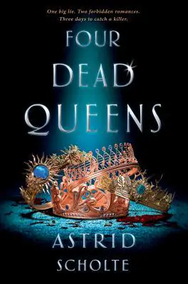
Idea #4. Color accents in design
The most striking covers are the simplest ones. A dark or muted background sets the mood — moody, serious, maybe even a little unsettling. Then, just one bold accent color steals the spotlight. It could be a splash of crimson, a flash of gold, or a cool electric blue. Maybe it’s a red scarf in a black-and-white street scene. Or glowing green eyes in the shadows. Or a single vivid flower blooming against a gray sky.
This technique works for different genres, especially well for thrillers, horror, gothic fiction, or any story with a dark twist. It’s also a clever way to highlight a symbolic object or theme from the book. The result? A cover that’s not only beautiful but unforgettable.
 |
 |
 |
| Getcovers | Source | Getcovers |
Idea #5. Attention-grabbing contrasts
Light and dark. Sharp and soft. Warm and cold. Playing with contrast makes a cover stand out. It adds drama. It makes things feel intense, even before the reader opens the book. You can use it to show conflict — good vs. evil, hope vs. fear. It works in all kinds of stories, from epic fantasy to detective tales. A strong contrast gives the cover a punch. And people will notice.
 |
 |
 |
| Source | Getcovers | Getcovers |
Idea #6. Stylized typography
Sometimes the title alone can be the star of the cover. When you play with typography—using unique lettering, adding texture, or weaving symbols into the words — you grab attention right away. Instead of picking a standard font, you can design the title from scratch or use images to shape the letters.
Think of a horror title where the “I” is a rose, or a fantasy book where vines twist through the letters. These little tricks add meaning and make the design more memorable. It’s a great choice for thrillers, fantasy, and anything with a hidden message.
 |
 |
 |
| Getcovers | Getcovers | Source |
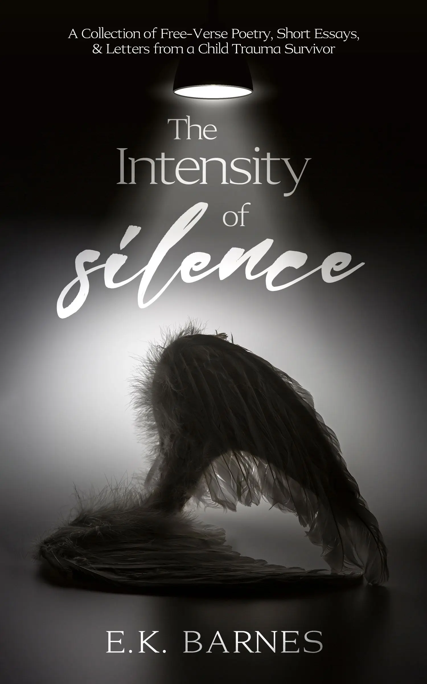
Idea #7. Hinting minimalist in cover design
You don’t always need a busy scene to spark curiosity. Sometimes, one small image says more than a whole landscape. A single feather, a red thread, or a door slightly ajar can create just enough mystery to pull a reader in. Minimalist covers are clean and elegant. They leave room for the imagination and make you pause and wonder.
Thus, discreet artwork is perfect for poetry, literary fiction, or even quiet thrillers — books that speak softly but leave a strong impression.
 |
 |
 |
| Getcovers | Source | Source |
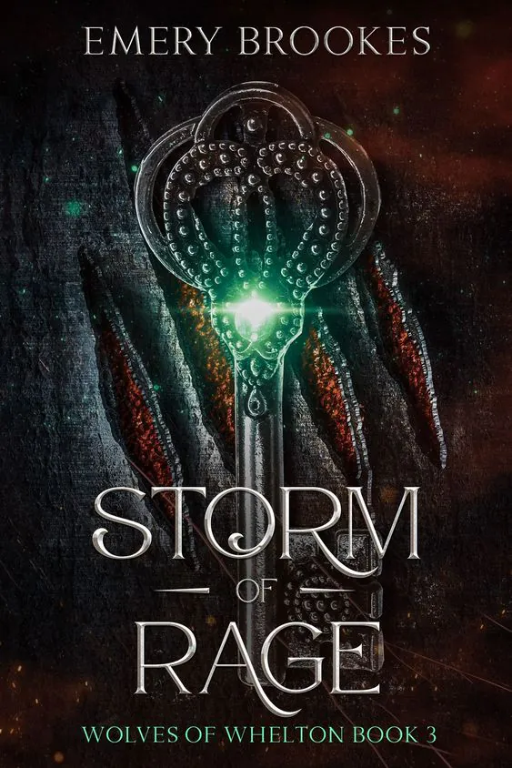
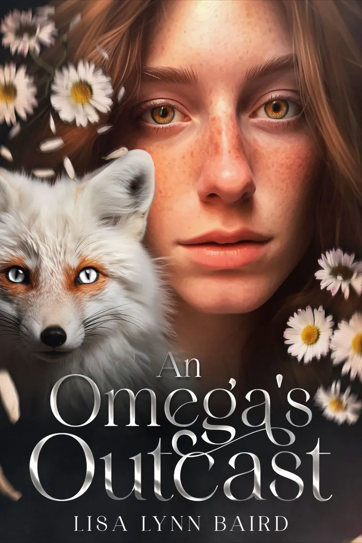
Idea #8. Strong focal point
Covers with a clear focal point are hard to scroll past. It might be a character staring right at you, a glowing artifact, or a dramatic scene frozen in time. Whatever it is, it grabs your eye first and pulls you into the world of the story. These bold visuals are common in fantasy, but they also work in sci-fi, adventure, and even romance. The key is that the focus tells a story. You look at it and instantly want to know what happens next.
 |
 |
 |
| Getcovers | Getcovers | Source |
Idea #9. Voluminous details
Covers that look touchable — like they have depth or texture — feel real in a way flat designs don’t. Think embossed lettering, raised symbols, or 3D elements that almost jump off the page. These little touches invite readers to pick the book up. They create a sense that what’s inside is just as rich and layered as what’s outside. Voluminous details work well across genres, especially when the story feels immersive, magical, or intense.
 |
 |
 |
| Source | Source | Getcovers |
Idea #10. Non-standard text layout for book cover design
Sometimes, breaking the rules makes the best design. Instead of centering everything neatly, try letting the title curve around an image, tilt across the page, or weave between illustrations. This kind of layout adds movement and energy. It makes the whole cover feel alive. And when done right, it leads the eye where you want it to go.
Non-standard layouts are great for books that are bold, quirky, or experimental — anything that dares to stand out.
 |
 |
 |
| Source | Getcovers | Source |
Idea #11. Abstract visuals
Not every book needs a clear picture on the cover. Sometimes, abstract shapes, bold patterns, or strange color combinations can say just as much, if not more. These covers don’t show exactly what’s happening in the story. Instead, they hint at feelings, themes, or moods. Maybe there’s a swirl of dark colors to suggest chaos, or soft lines to show calm and beauty.
The beauty of abstract covers is that they leave space for the reader’s imagination. They’re great for poetry, memoir, literary fiction, art books, or stories that live outside the box.
 |
 |
 |
| Getcovers | Source | Source |
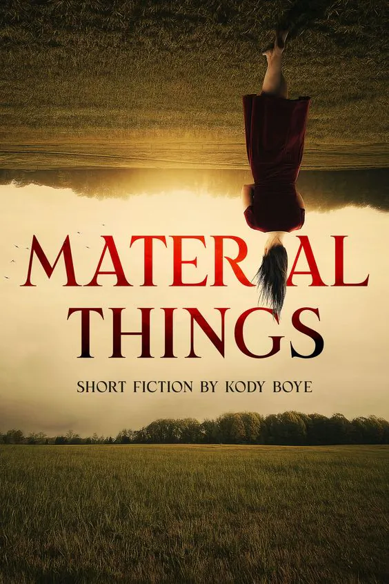
Idea #12. Upside-down composition
Want to stop someone mid-scroll? Flip the design upside down. It’s unexpected, and that’s what makes it effective. A cover with an upside-down figure, landscape, or text catches the eye because it goes against what we’re used to. It makes people look twice. This trick works well for stories about change, reversal, or hidden truths. It tells the reader, right from the start: “This book will turn your world around.”
 |
 |
 |
| Getcovers | Source | Source |
Idea #13. Using two scenes as one of the book cover ideas
Some stories are too rich to sum up with a single image—and that’s where the two-scene cover comes in. This design approach blends two different moments or settings into one powerful visual. The main scene might be emotional or dramatic—a couple reaching for each other, a battle unfolding, a character staring out at the unknown. The secondary scene adds depth, showing a memory, a secret, or even a contrasting world.
These two layers work together to reflect the complexity of the story. It could be past and present. Dream and reality. Love and loss. This kind of cover draws the reader in and makes them curious — how are these scenes connected? What happened between them? It’s a great fit for books that focus on relationships, emotional growth, or dual timelines, especially in genres like romance, drama, family sagas, and literary fiction.
 |
 |
 |
| Getcovers | Getcovers | Source |
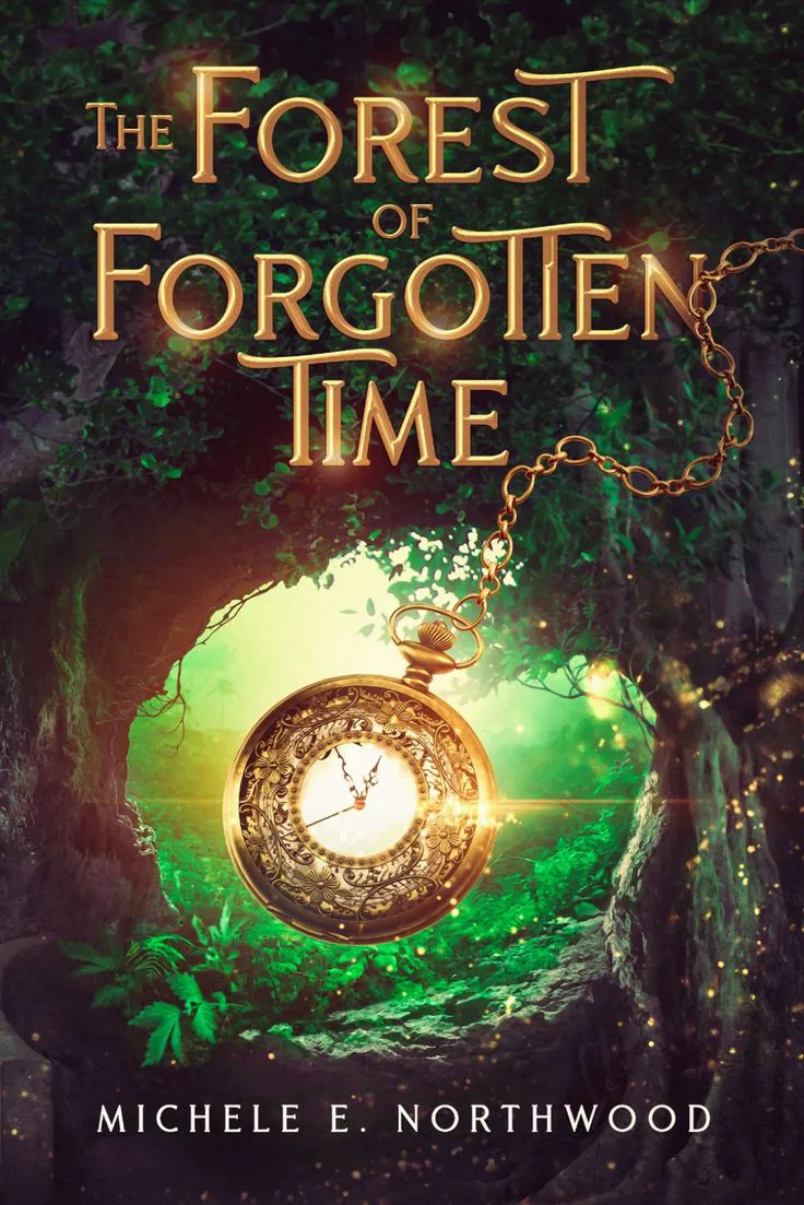
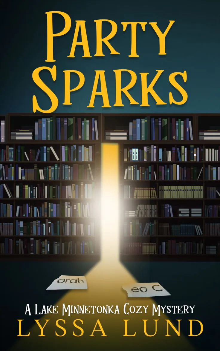
Idea #14. Meta elements
Some covers blur the line between the story and the act of reading itself. They use “meta” visuals — like an open book, a doorway, or a window — to suggest that picking up this book is the first step into another world. These elements act as portals. A crack in the wall with light spilling through. A book with glowing pages. A keyhole showing something magical on the other side.
It’s a clever way to show that the story isn’t just on the page — it’s something bigger, something waiting to be discovered. This type of design works well for fantasy, magical realism, or any book that wants to remind readers how powerful stories really are.
 |
 |
 |
| Getcovers | Getcovers | Source |
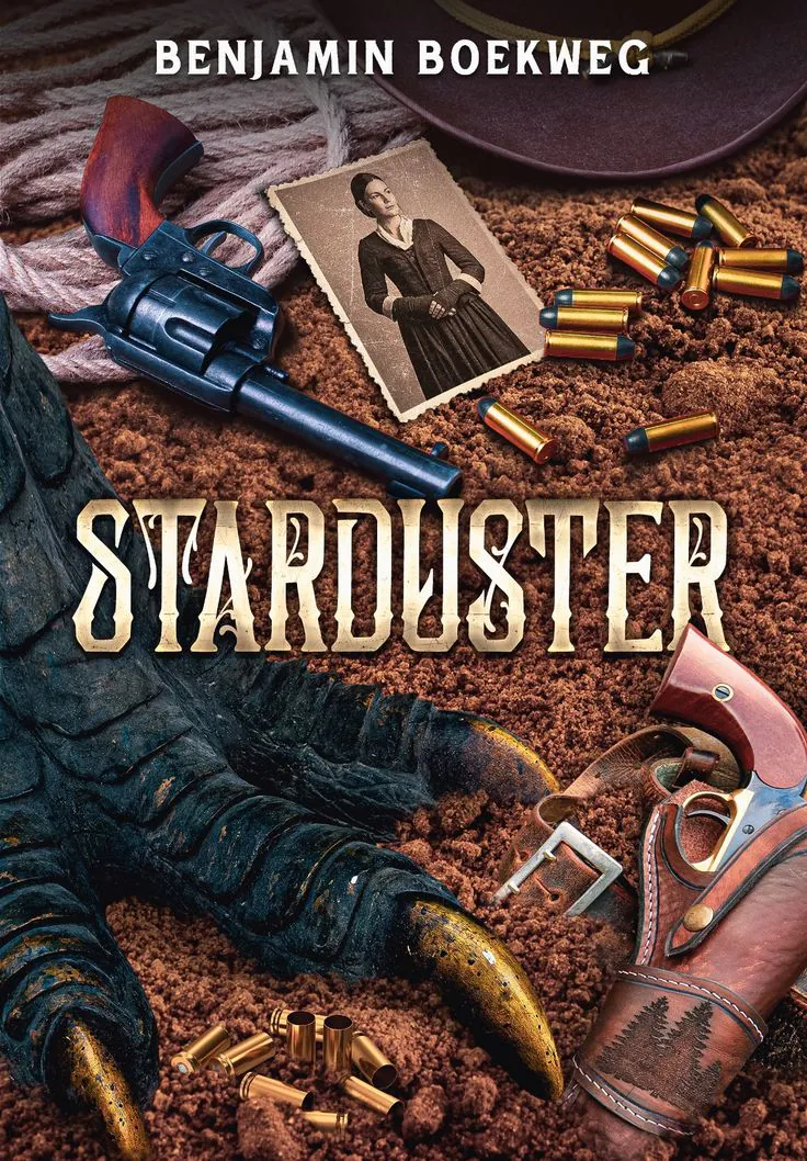
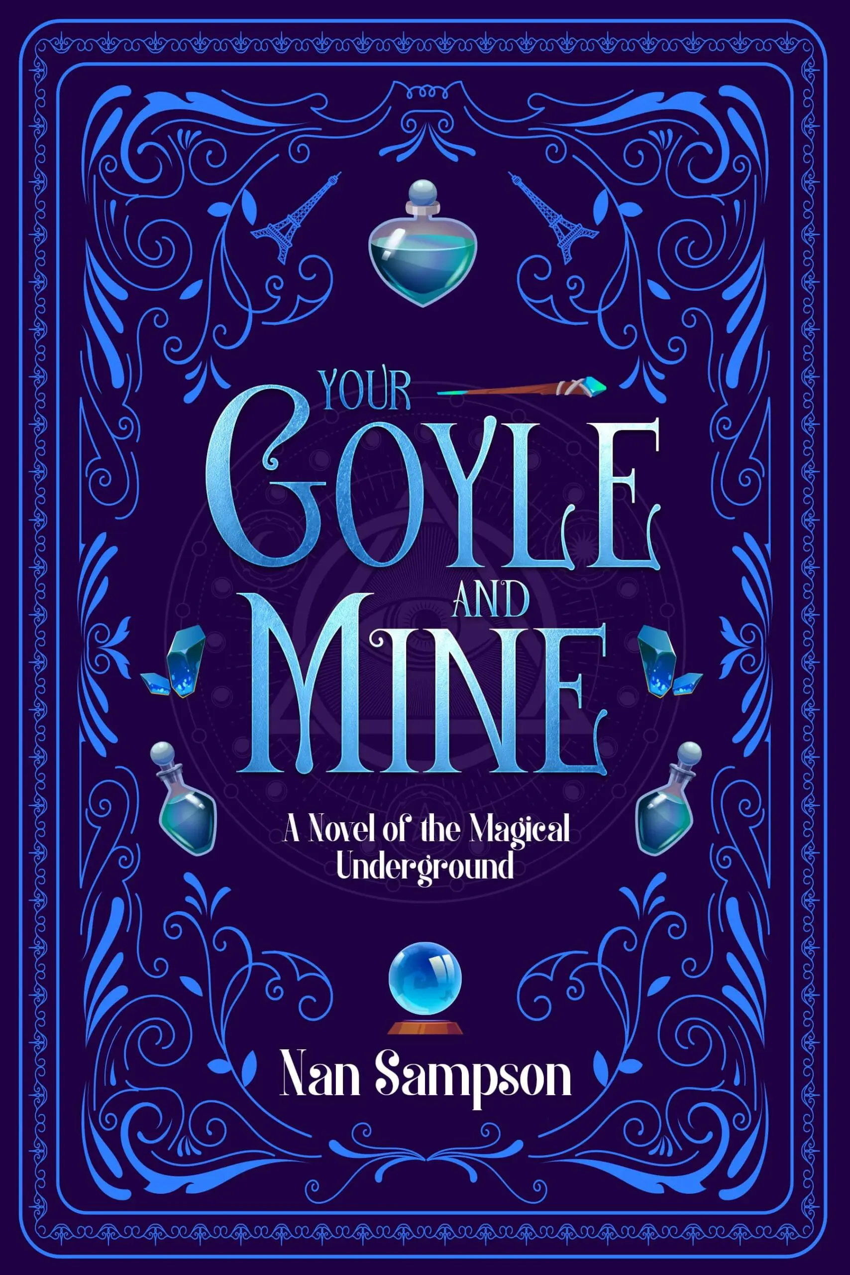
Idea #15. Set of objects
Sometimes, the tiniest things say the most. A cover featuring a group of meaningful objects — like a key, a letter, a ring, or a compass — can feel like a puzzle to solve. Each item adds a clue about the story. Together, they hint at mood, genre, and plot without giving too much away. This type of design works beautifully for fantasy, mystery, or adventure novels, where details matter and every item has a story behind it.
 |
 |
 |
| Getcovers | Source | Source |
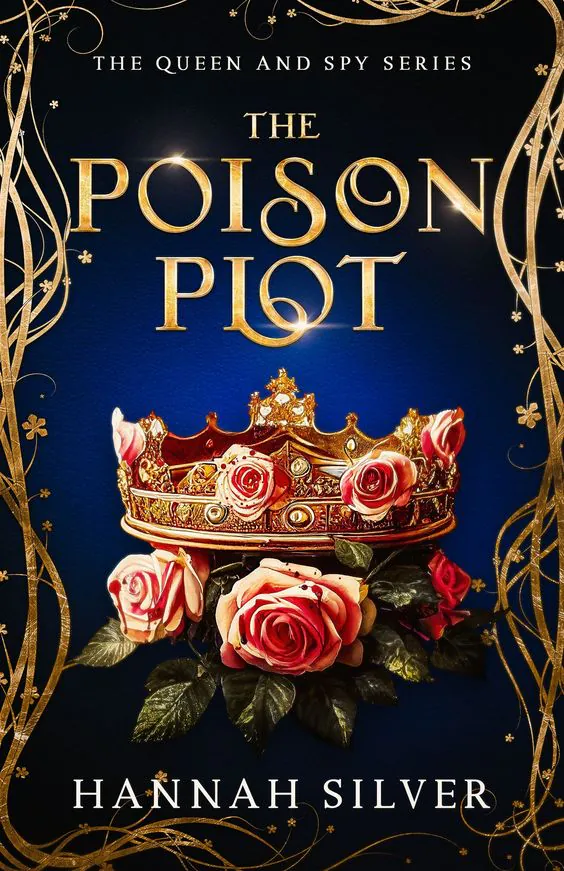
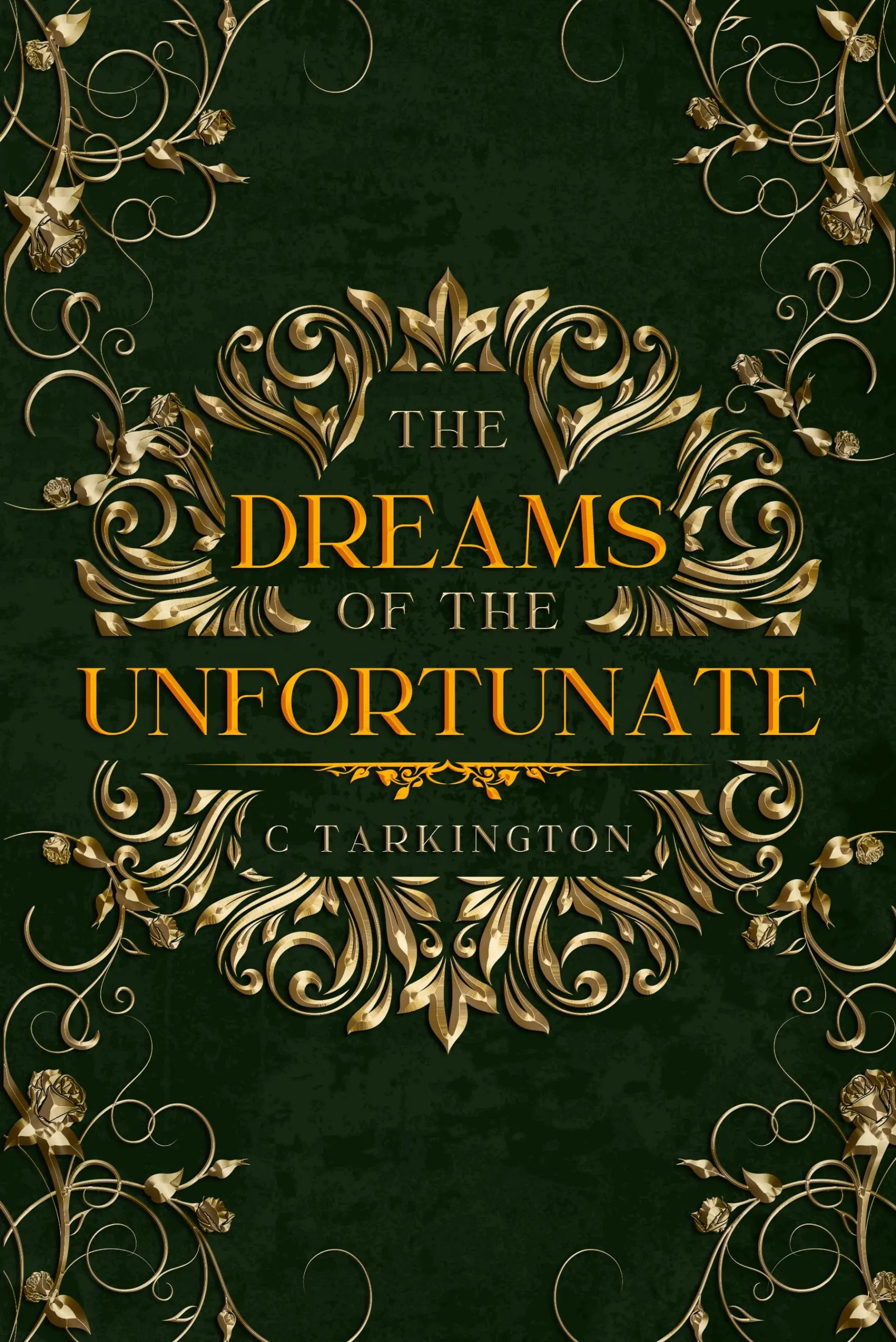
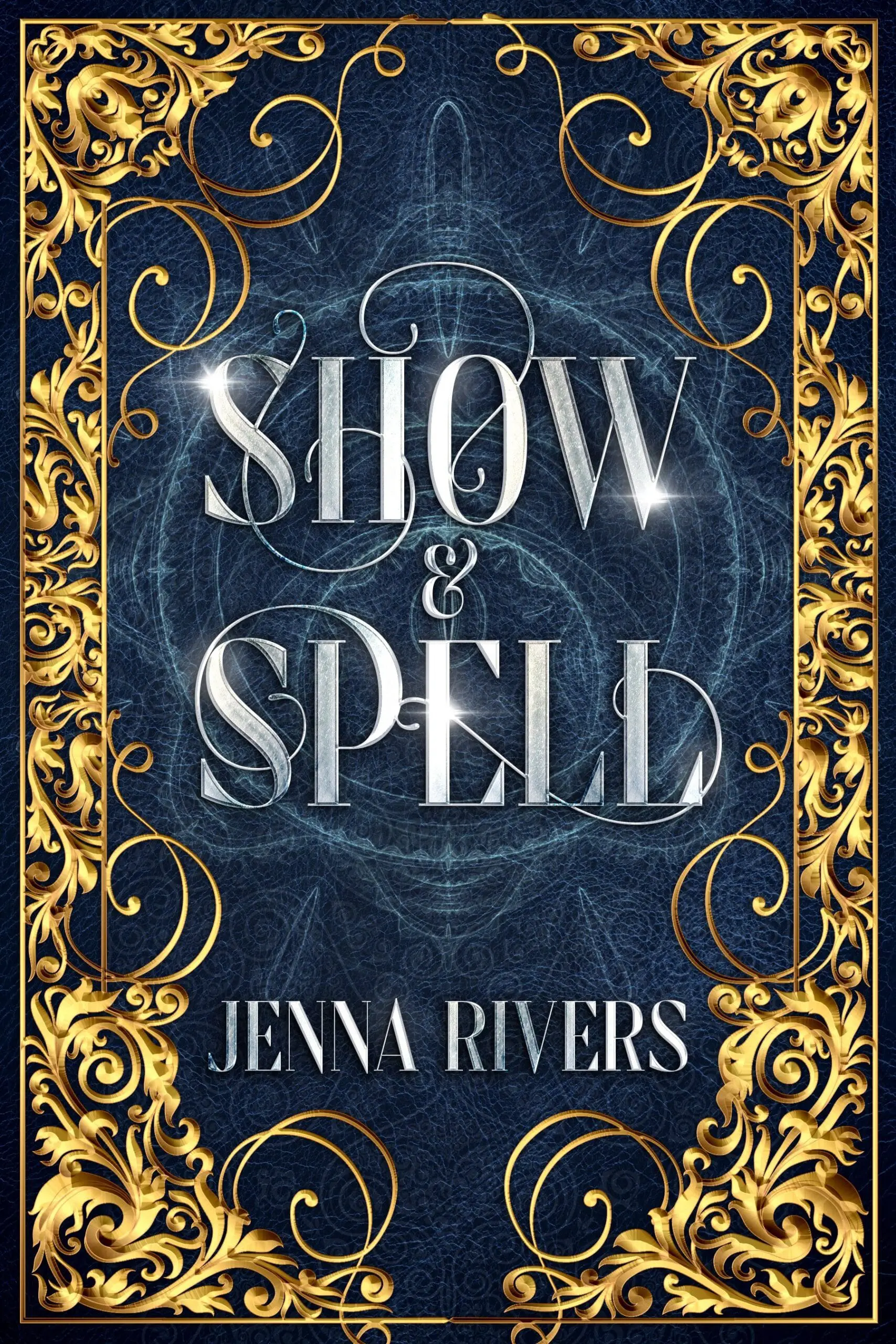
Idea #16. Ornate patterns for good book cover design
There’s something timeless about a cover filled with intricate patterns. Elegant swirls, filigree borders, gold-foil accents, or delicate floral motifs instantly create a sense of luxury and care. These designs don’t scream for attention — they draw you in slowly, like a whispered secret or an old tale waiting to be told.
Ornate patterns suggest that what lies inside is rich in meaning, atmosphere, and craft. They’re especially fitting for historical fiction, classic-inspired fantasy, or literary novels — books that reward readers who love detail and depth. These covers often feel like antique treasures, like something you’d find in a forgotten library or a royal archive.
 |
 |
 |
| Getcovers | Getcovers | Getcovers |
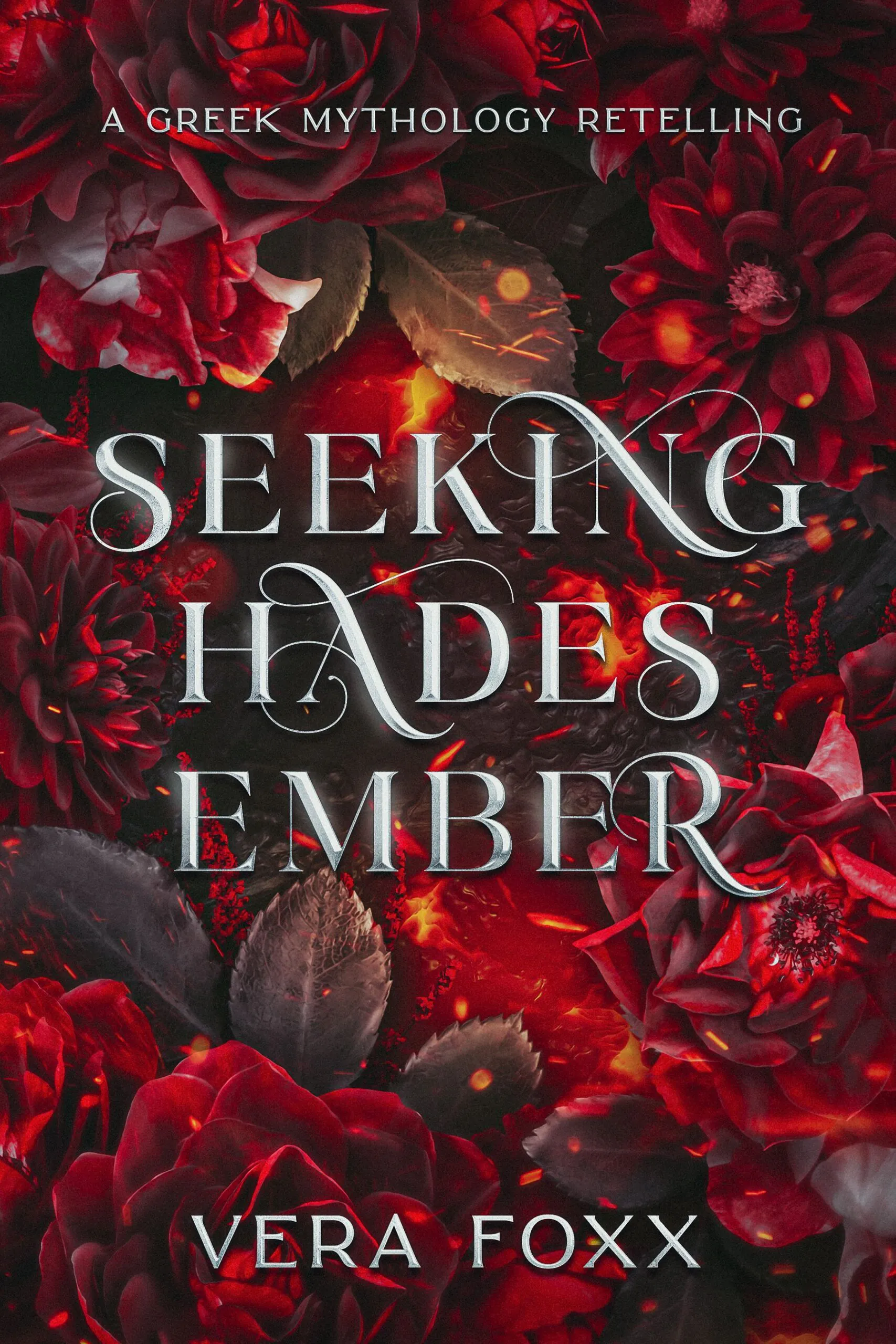
Idea #17. Floral motifs for inspiration
The beauty of floral motifs lies in their versatility. They can feel soft and romantic, wild and natural, or even eerie and symbolic. It all depends on the colors, layout, and how they interact with the rest of the design. A delicate rose on a clean background might speak to quiet love or personal growth. A cluster of overgrown flowers wrapping around a title could suggest something more haunting, like memories that won’t fade or nature reclaiming its space.
These covers work beautifully for genres like romance, poetry, literary fiction, and cozy mysteries. But they’re also a clever way to soften heavier themes or hint at hidden layers beneath the surface. Floral covers are gentle, expressive, and often unforgettable — just like the stories they protect.
 |
 |
 |
| Getcovers | Getcovers | Getcovers |
Idea #18. Shining, sparkling, and glowing
Covers that glow, shimmer, or sparkle feel full of magic. They suggest wonder, discovery, and the kind of story that lifts you out of the real world. Light effects — like glowing symbols, stars, or sparkles — can point to hope, transformation, or secrets waiting to be revealed. These covers grab attention fast and are especially powerful for fantasy, magical adventures, or uplifting tales with a touch of the extraordinary.
 |
 |
 |
| Getcovers | Getcovers | Getcovers |
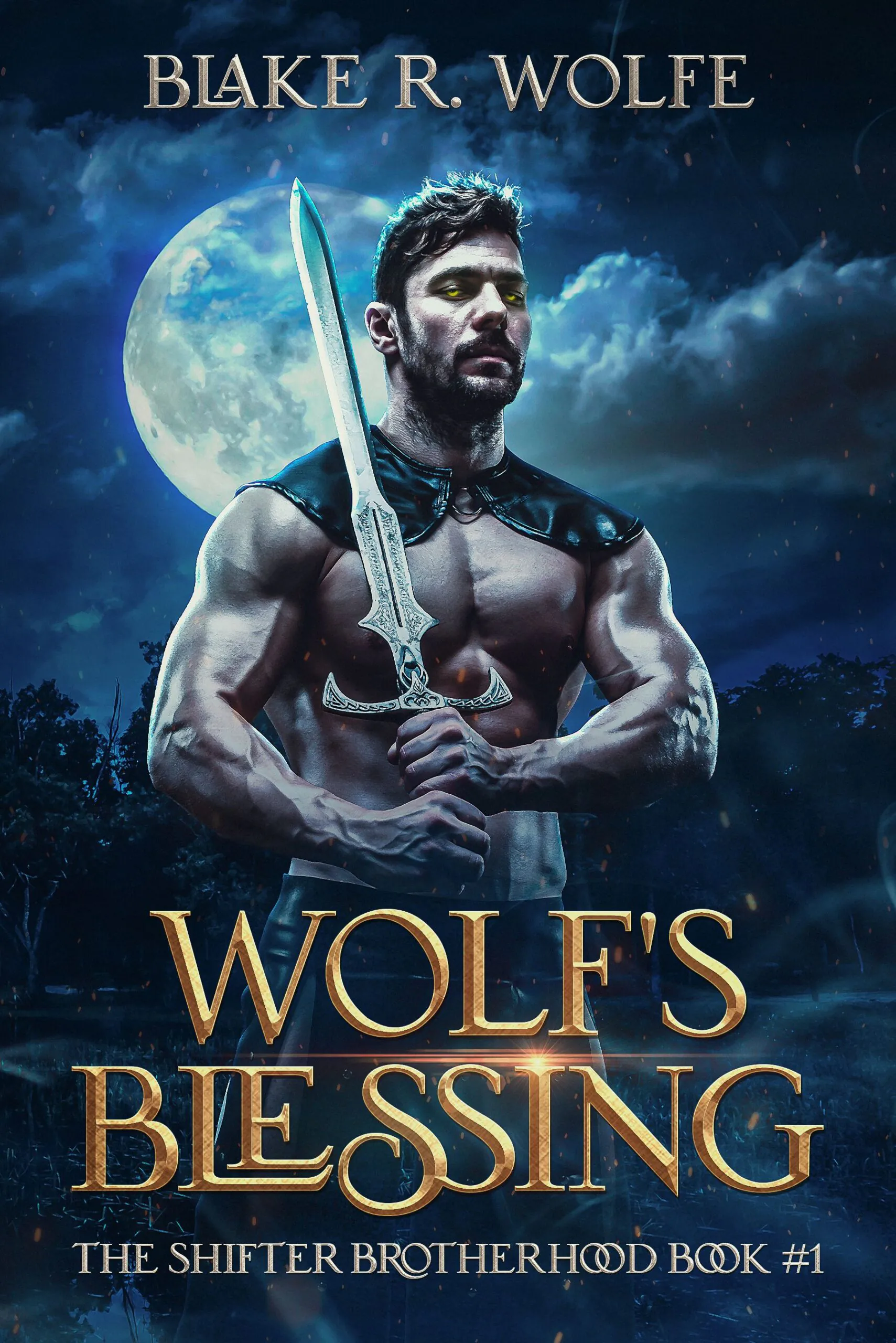
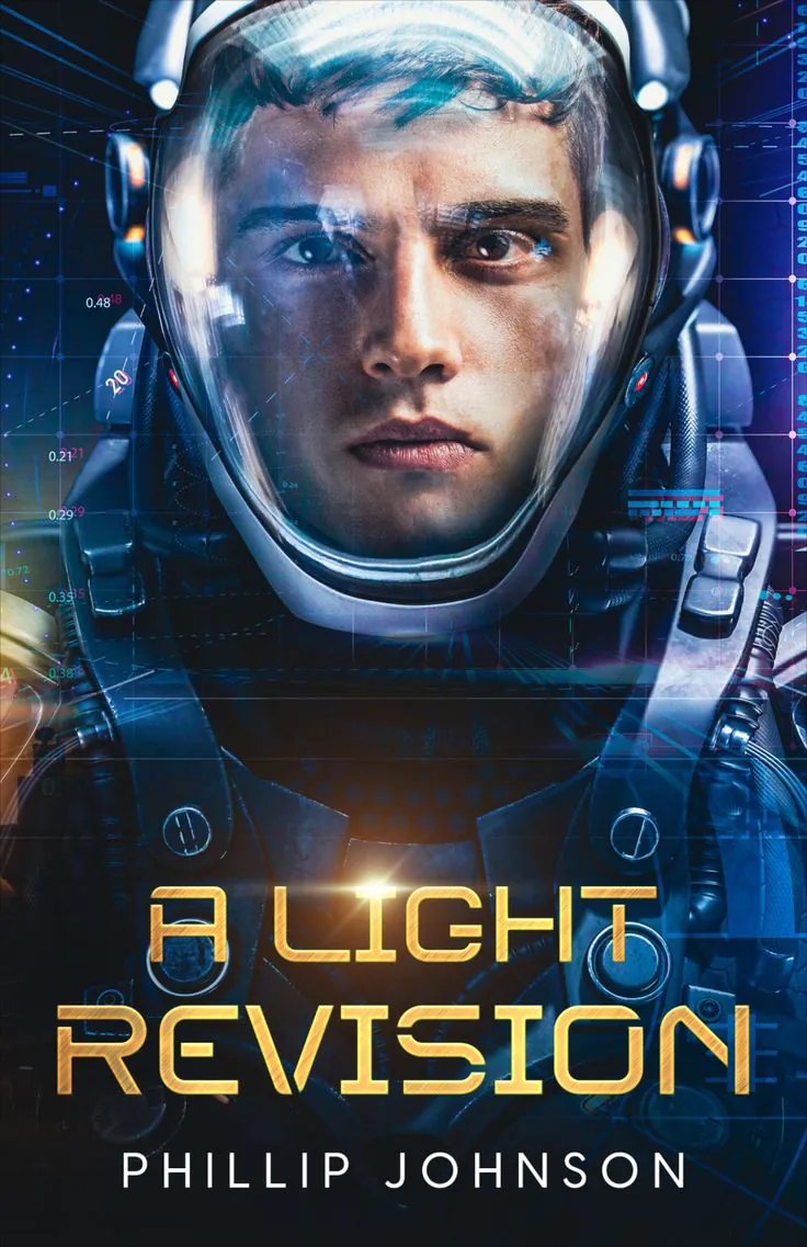
Idea #19. Impressive character
All it takes is one powerful figure on the cover to grab a reader’s attention. Whether it’s a lone warrior standing against a storm, a mysterious stranger cloaked in shadows, or a confident hero meeting your gaze, a strong character-centered design makes an instant connection. It tells you right away: this story is personal.
This style works across a wide range of genres — epic fantasy, sci-fi, action-packed thrillers, dystopian adventures, and even romance. If your book is character-driven and emotional, this is a design idea worth exploring. It’s bold, personal, and memorable — just like a great protagonist.
 |
 |
 |
| Getcovers | Getcovers | Getcovers |
Idea #20. Eye-catching color blends
The colors are the story. A well-blended mix of vibrant hues or smooth gradients can turn a simple cover into a showstopper. Think glowing sunsets that melt from orange to pink, or deep blues fading into smoky purples. These kinds of covers don’t need busy imagery — they stand out because the color itself is doing the talking.
Color blends instantly set the mood. Warm tones like peach, coral, or gold can make a book feel cheerful, romantic, or full of hope. Cooler colors like teal, navy, or lavender hint at introspection, mystery, or fantasy. When you combine them just right, the result is emotional and eye-catching, often more memorable than a detailed illustration.
 |
 |
 |
| Getcovers | Getcovers | Getcovers |
Summing up
We hope you enjoyed this collection of 20 book cover design ideas and got enough design inspiration! Whether you’re publishing your debut novel or giving your series a fresh new look, these concepts and templates show just how much power a great cover holds. A strong visual doesn’t just attract attention — it sets the tone and invites readers into the writer’s world.
From mysterious silhouettes to glowing details, floral elegance, and bold typography, each idea offers a unique way to express your story’s mood and meaning. You can even mix and match styles to create something that truly feels like you.
What idea did you enjoy the most? Share your thoughts in the comments.


