


We all know the saying, “Don’t judge a book by its cover,” but let’s be real – covers matter. A great cover can make someone stop, look, and pick up a book.
We’ve found 10 amazing book covers that do just that! In this post, let’s take a closer look at what makes them work. From colors and fonts to layout and details, we’ll break down how these covers pull readers in.
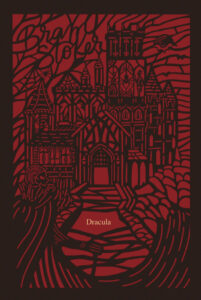
Dracula by Bram Stoker
This Dracula cover is a total showstopper. The bold red and black combo screams mystery and danger, while the intricate artwork makes it feel like a piece of gothic art.
Why this design works:
- The detailed castle and swirling lines make everything feel dark and dramatic, just like the story itself.
- Red and black are the ultimate spooky color combo, instantly bringing to mind blood, danger, and the supernatural.
- The design resembles stained glass, giving it an artsy, expensive feel.
- Bats, creepy shadows, and eerie figures set the perfect vampire mood without being over the top.
- It keeps the old-school gothic vibe but with a fresh, stylish twist, so it feels classic but not outdated.
- The author’s name blends smoothly into the artwork, while the title is simple and elegant.
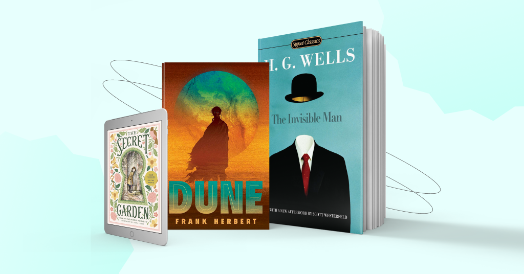
The Secret Garden by Frances Hodgson Burnett
The Secret Garden cover is pure magic. With its soft colors, vintage-style illustration, and charming floral border, it feels like stepping right into a fairy tale. The keyhole design makes it extra special, giving you the sense of peeking into a hidden world.
Why this design works:
- The keyhole framing is a genius touch, making it feel like you’re about to unlock a secret adventure.
- The soft greens, pinks, and yellows give the cover a warm, inviting, and timeless feel.
- The delicate floral illustrations, tiny birds, and hidden key add a whimsical, storybook charm.
- The vintage watercolor-style illustration makes it feel like a classic, beautifully preserved over time.
- The typography is elegant and flowing, perfectly matching the dreamy and mysterious atmosphere of the book.

The Talented Mr. Ripley by Patricia Highsmith
The Talented Mr. Ripley cover is effortlessly cool and full of suspense. With its noir-inspired black-and-white imagery set against a bold, textured orange backdrop, it immediately gives off a vibe of mystery, deception, and intrigue.
Why this design works:
- The striking cut-out silhouette suggests deception and shifting identities, perfectly fitting the novel’s themes.
- The black-and-white imagery inside the silhouette gives the cover a classic film-noir feel, making it instantly cinematic.
- The checkered floor, dramatic lighting, and shadowy figures add tension and unease, drawing you into Ripley’s world of crime and manipulation.
- The textured orange background adds a modern edge, making the design bold and eye-catching.
- The typography is crisp and understated, letting the visuals take center stage while still feeling sophisticated.
- The overall design is sharp, stylish, and filled with intrigue – just like the psychological thriller it represents.

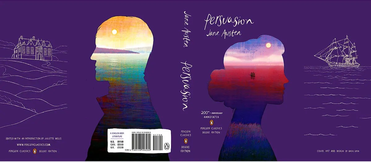
Persuasion by Jane Austen
The Persuasion cover is pure elegance. The deep purple background sets a dreamy tone, while the double silhouette design feels both modern and timeless. Inside the profiles, stunning landscapes unfold, capturing the novel’s themes of love and second chances.
Why this design works:
- The double silhouette effect beautifully represents the novel’s central relationship, emphasizing distance, reflection, and connection.
- The sunset and sea imagery inside the figures create a sense of nostalgia and quiet yearning, mirroring the emotional depth of the story.
- The deep purple background adds richness and sophistication, making the design luxurious.
- The delicate hand-drawn elements, like the stately home and sailing ship, subtly reference key moments in the novel.
- The handwritten-style typography adds a personal, intimate touch, making the book feel like a treasured letter from the past.
Breaking Waves Series by Kristina Moninger
Breaking Waves series cover design is effortlessly cool and completely mesmerizing. With stunning aerial shots of the ocean in dreamy shades of blue, pink, and purple, each cover feels like a breath of fresh, salty air.
Why this design works:
- The ocean imagery creates a sense of movement and emotion, perfectly matching the themes of love, change, and discovery.
- The color palette is soft yet vibrant, with each book getting its own unique sunset or wave-inspired hue.
- The mix of handwritten and bold typography adds a romantic and contemporary touch, making it feel personal yet stylish.
- The surfers and beach elements hint at themes of escape, passion, and finding yourself, adding an irresistible wanderlust vibe.
- The whole series looks cohesive yet distinct, making you want to collect every book and dive right in.

Dune by Frank Herbert
This Dune cover is nothing short of epic. With a dramatic silhouette against a glowing, otherworldly backdrop, it immediately captures the vastness, mystery, and power of Arrakis.
Why this design works:
- The striking silhouette gives the cover a sense of mystery and power, pulling readers into the story’s world of survival and prophecy.
- The large glowing orb in the background feels almost like a second planet, reinforcing the book’s sci-fi grandeur.
- The golden sand textures and deep blues reflect the harsh desert landscape and the mystical allure of spice.
- The typography is strong and bold, grounding the cover while keeping the focus on the stunning artwork.
- The blue eyes of the character are a small but powerful detail, signaling the influence of spice and the deep lore of the Dune universe.

The Shadow of the Wind by Carlos Ruiz Zafón
The Shadow of the Wind cover doesn’t just set the tone – it makes readers want to dive into the labyrinth of books inside. Blending the texture of an open book with the shadowy streets of old Barcelona, it instantly pulls you into its world of forgotten stories and hidden secrets.
Why this design works:
- The open book design makes it feel like you’re stepping straight into the story, blurring the line between fiction and reality.
- The sepia-toned cityscape and dim lighting add a sense of nostalgia and mystery, perfectly matching the novel’s themes.
- The lone figure looking back adds an air of secrecy and adventure, making you wonder what he’s running from—or toward.
- The streetlamp’s glow creates a cozy yet eerie atmosphere, reinforcing the book’s gothic and literary mood.
- The typography is bold but classic, seamlessly blending into the open book and making it feel like the title is part of the narrative.

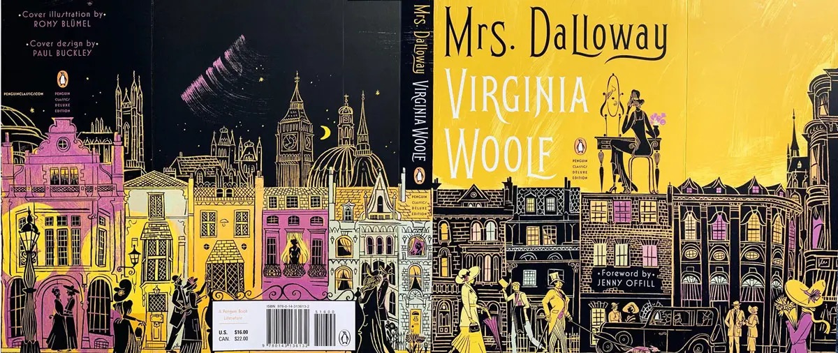
Mrs. Dalloway by Virginia Woolf
The Mrs. Dalloway cover is an absolute showstopper. With its vibrant yellow and deep purples, it brings 1920s London to life in a way that feels both whimsical and sophisticated.
Why this design works:
- The rich yellow and purple color scheme makes the cover feel warm, lively, and unforgettable.
- The hand-drawn cityscape is packed with charming details, from the bustling streets to elegant figures, reflecting the novel’s themes of time, memory, and social life.
- The mix of light and dark buildings creates contrast, mirroring the highs and lows of Clarissa’s day and the novel’s deeper emotional layers.
- The vintage-inspired typography feels both classic and playful, setting the perfect tone for Woolf’s modernist masterpiece.
- The rooftop scenes, Big Ben, and nighttime sky add an almost theatrical feel, making the cover feel like a stage where the characters’ lives play out.
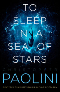
To Sleep in a Sea of Stars by Christopher Paolini
To Sleep in a Sea of Stars cover is absolutely mesmerizing. With its deep cosmic blues and an ethereal figure drifting through space, it perfectly captures the vastness, mystery, and wonder of the unknown.
Why this design works:
- The floating figure instantly evokes a sense of weightlessness, making it feel like the reader is plunging into the unknown right along with them.
- The vibrant blue nebula contrasts beautifully against the deep black of space, creating a striking and otherworldly effect.
- The minimalist typography feels crisp and futuristic, letting the imagery do most of the storytelling.
- The title’s arrangement across the vast space enhances the feeling of drifting and discovery.
- The glow and scattered particles add a dreamlike quality, reinforcing the book’s blend of science fiction and awe-inspiring wonder.
- The author’s name in bold blue makes it pop while keeping the sleek, modern aesthetic intact.
The Invisible Man by H.G. Wells
The Invisible Man cover is brilliantly simple and instantly intriguing. With a floating bowler hat and a crisp suit with no face beneath, it captures the eerie, unsettling nature of H.G. Wells’ classic sci-fi horror.
Why this design works:
- The floating hat and empty suit create an immediate sense of mystery, playing with the idea of invisibility in a visually striking way.
- The bold contrast between the black suit, red tie, and bright blue background makes the cover pop, giving it a sleek, almost surreal quality.
- The simplicity of the design mirrors the novel’s psychological tension, leaving space for the reader to imagine the man behind the missing face.
- The elegant typography blends classic and modern elements, reinforcing the timelessness of the story.
- The overall design is both playful and unsettling, drawing readers in with its stylish execution while hinting at the darker story beneath.

To wrap up
Now, you can see how even the smallest details in colors, fonts, spacing, and imagery work together to create a powerful first impression. A well-designed cover isn’t just about looking good; it’s about grabbing attention, setting the right mood, and making readers curious about what’s inside.
Which of these covers did you like the most? Which cover of a famous book is your favorite? Let’s talk in the comments.


