


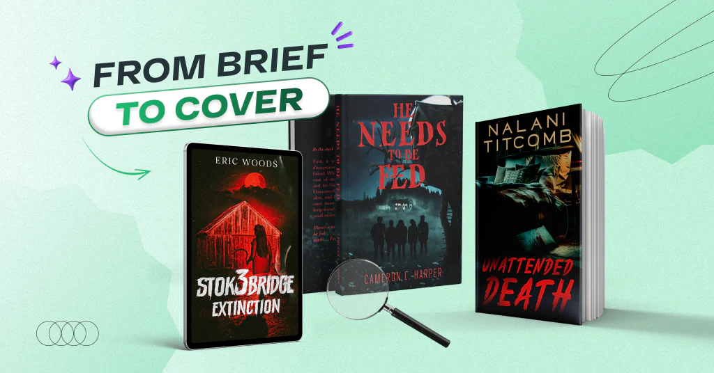

Halloween is just around the corner, and we’re ready to set the mood. Today, we’re taking you behind the scenes of five spooky book cover designs, from horror to thriller. You’ll see what the authors had in mind, how our designers brought their ideas to life, and which changes turned the first concepts into the final covers.
Let’s dive in!
1. STOK3BRIDGE: Extinction by Eric Woods (Horror)
Eric Woods asked for a nighttime setting in black, red, and white. The main focus was a woman with long hair, holding a sickle and standing in front of an abandoned auto garage. Our designer created this version.
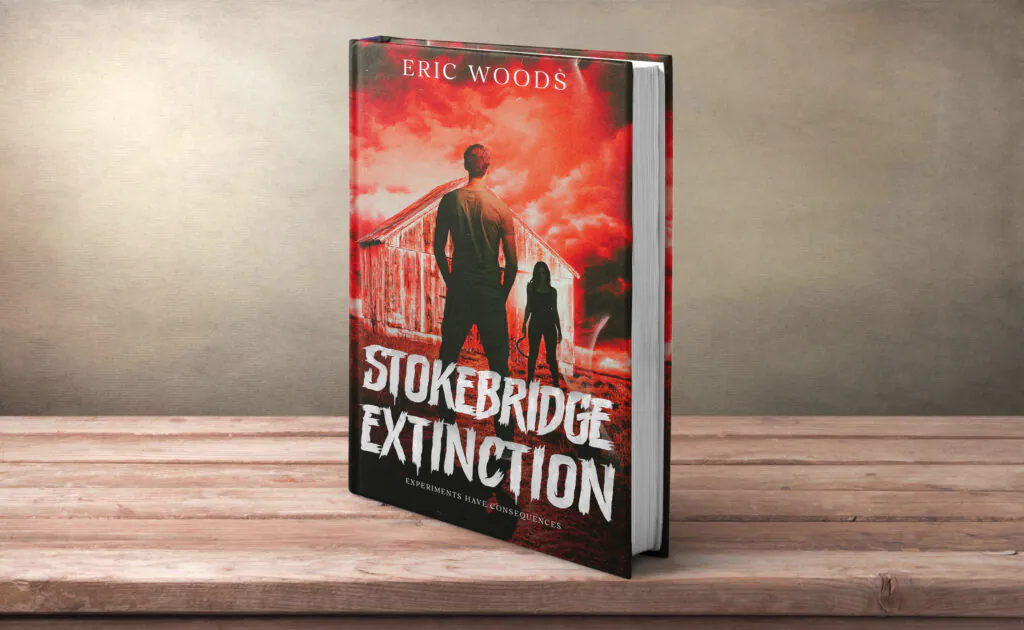
After reviewing the first concept, the author requested a few changes:
- Remove the male character and make the woman look older;
- Make the scene darker and reduce the red tones for a more realistic nighttime mood;
- Adjust the title typography: make the “3” larger and “Extinction” smaller.
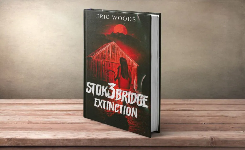
With these tweaks, we got an unsettling final cover.
2. He Needs to Be Fed by Cameron L. Harper (Mystery Horror)
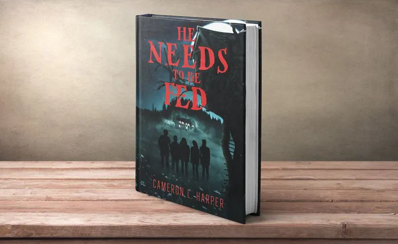
Cameron L. Harper envisioned an eerie scene: an abandoned house on a mountain, a small forest, and a field with a single tree and a treehouse. He also wanted five preteen children shown as silhouettes, standing together and looking up toward the house. At the same time, the author gave our designer creative freedom to add their own vision.
Our designer combined these ideas into a mysterious cover.
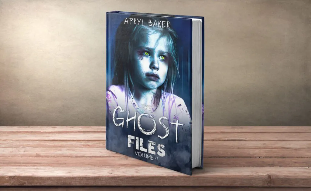
3. The Ghost Files by Apryl Baker (Young Adult Horror)
Apryl Baker knew exactly which detail mattered most. She asked us to focus the design on a little boy with glowing yellow eyes. He should look about eight years old, with a bruised face.
With that direction in mind, our designer created a spooky book cover.
4. The Lake Toplitz Code by Courtney Hargrove (Thriller)
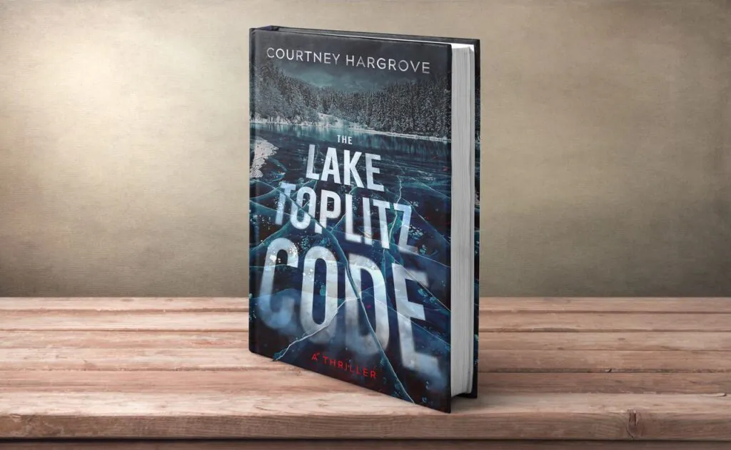
Courtney Hargrove wanted a mysterious cover that reflected the story of hidden Nazi gold at the bottom of a deep lake in Austria. She pictured a cold scene: a lake surrounded by pine forests and snow, with the title front and center. The author also suggested blending the typography into the water or cracked ice and adding a touch of red.
Our designer brought these ideas to life, and the first concept was almost perfect. The only change was a small tweak to the author’s name font.
5. Unattended Death by Nalani Titcomb (Psychological Thriller)
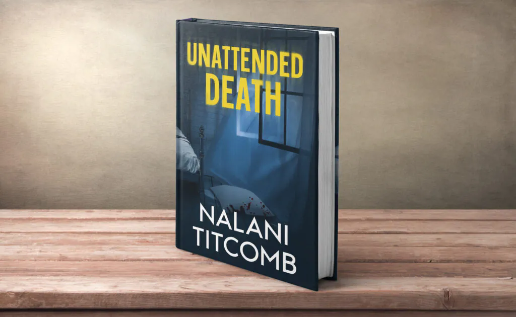
Nalani Titcomb wanted a cover that would instantly create a sense of mystery and danger. Her idea was an unsettling bedroom with an open window, flowing curtains, and a mattress on the floor. Subtle bloodstains and other disturbing details would hint at a possible crime scene.
Our designer created the first concept based on these ideas, and Nalani liked the direction.
But the author still had a few suggestions to make the cover even stronger:
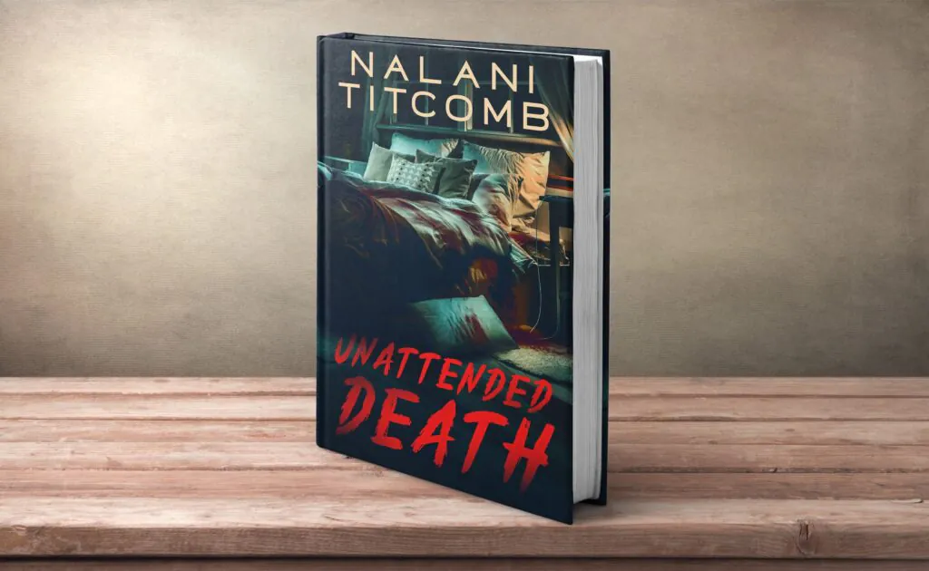
- Move the author’s name to the top and make it larger;
- Change the title’s font and color;
- Make the mattress and pillow equally noticeable, with subtle stains and signs that a body had been lying there;
- Extend the scene to show more of the messy room.
After these changes, the final design captured the disturbing atmosphere Nalani had in mind. It also left plenty of details to make readers wonder what happened in that room.
Summing up
And that’s how we bring book covers to life, from the author’s first brief to the final design. Horror and thriller books can look very different, but every spooky book cover shares one goal: to create mystery, tension, or fear. Sometimes it’s a creepy character, a dark setting, or just a small detail that makes readers wonder what happened.
Now we’d love to hear from you. Which of these five covers did you like the most? Let us know in the comments.


