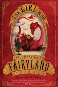
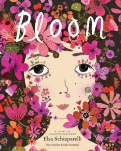
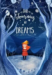
Where does the desing of a book for kids begin? Lewis Caroll in his “Alice in Wonderland” once said:
What is the use of a book without pictures?
It sums up the main principle the book art for the youngest: use images and illustrations to draw the kids’ attention. However, you also need to pay attention to market research, colors, and typography to end up with the design that kids will not be able to walk pass.
In this article, we will explain to you how to master the children’s book cover design and provide ides to help you capture childhood magic.
Children’s book cover design ideas
Keep reading to learn how to choose the perfect illustration, fonts, and colors appropriate for your target age group. We guarantee that young readers will become all bright-eyed and bushy-tailed.
On your marks, get set, go!
Pay attention to your target age group
It’s time to address the elephant in the room and start with the first and most important rule in book art for kids. The book cover MUST be appropriate for its age group. That’s the key factor to take into consideration before you even start coming up with design ideas. We’ve put together some tips and tricks for book covers suitable for toddlers, school children, and teenagers.
Let’s take a closer look.
Children’s book cover design ideas for toddlers
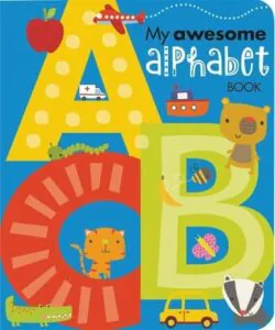
If you’re reading this, most probably, your target audience is children who can not read yet. The purpose of the book is to entertain them through lively images and teach some small lessons. For example, good manners or compassion and forgiveness. Some of these books also cover the school program’s basics, like counting and learning the ABCs. Keep in mind that the book’s interior design should include images and illustrations, and just little text blocks. That takes a bit of the pressure away from the front book cover design too.
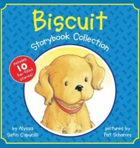
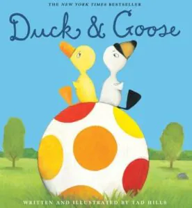
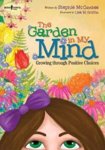
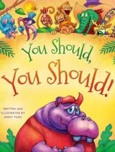
- It’s a good idea to play it safe and try to win over your little readers’ hearts through familiar images and pleasant color pallets. Speaking about images, it’s best not to include strange characters and actual photographs. Go with the mainstream creature that the kids already know something about—a cat, a rabbit, flowers, or sun. The best idea is to include illustrations with happy and friendly facial expressions.
- Depending on the purpose of your book, choose the color palette wisely. If it’s a collection of bedtime stories, go with soft, calming colors. If you’re trying to educate the children, look into a brighter color theme to keep them engaged for as long as possible.
Children’s book cover design ideas for school kids
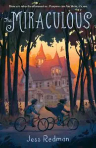
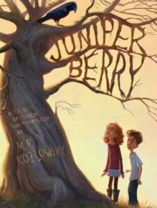
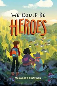
Chances are, in this category, the children start picking books in the bookstore on their own. The age might vary from first grade all the way to middle school. If you’re dealing with slightly older kids, your book might not have any additional images inside, which turns your book cover design into the lead attention-grabbing tool. Unless it’s children’s non-fiction like an encyclopedia, steer clear from photo-based design. Illustrations still remain a go-to.
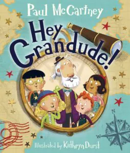
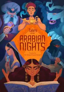
Though, you might want to make your characters less childish and more cartoonish and real. You can also add some additional details – don’t be afraid of creating a busy book cover design. However, decide what will serve as the eye-catching hook in your cover design. Your main purpose is to intrigue the young readers and turn your book cover into a treasure hunt.
Besides, you might start dealing with a series book cover design here. Things to keep in mind include:
- You can stick to the same font style. A great idea is to emphasize the series title, book title, or author’s name depending on what you choose as your branding element.
- On the other hand, you might want to turn colors into a distinguishing feature of the children’s book series. The same background color can be used to emphasize the connection between the books in the series. Or you can settle for different background colors but use similar hues.
- Finally, the most popular tactic in the children’s book cover design is to use images and illustrations as the link between the books in the series. For example, the protagonist and secondary characters can become the centerpiece of your cover. Choose different images for the background, depending on the setting and plot details, and you’ll be good to go.


Children’s book cover design ideas for teenagers
It’s extremely important to analyze and research current market trends, needs, and expectations to create a fantastic cover to hook teenagers. Think about it: your book will probably cover a bit more complex topics, such as first love, friendship, peer pressure, family conflicts, fashion, etc. Check what’s being done around you and what are the “hot” and “cool” trends in the market niche.
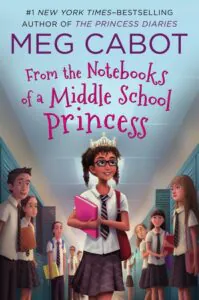
- Make sure that your imagery is up-to-date. As simple as it is, toss in modern technology, iPhones, current hair-cut trends, and clothing style. This way, you have higher chances of attracting teenagers to your design style since they’re often looking for something groovy and stylish.
- When it comes to colors, you might want to follow the rule: The brighter, the better—intense reds, bright greens, strong pinks, bold purples, you name it.
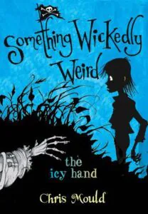
- Depending on a sub-genre, designers use eye-catching typography, sometimes borrowed from fantasy and chick-lit genres. However, once again, if you’re writing non-fiction for children, it’s best to settle for bald and classy fonts not to confuse and overwhelm young readers.
Now that you have a better idea of which design layout will be best for your age group, let’s talk more about all the cheerful colors, fonts, and illustrations in book art for kids.
Lively and merry fonts for children’s book covers
An excellent idea for kids’ cover art is to toss in some lively and jolly letters and fonts to tell the readers what a fun adventure they are about to start.
Here are a few ideas for the fonts the youngest readers will enjoy:
- Caroni
- Comfortaa
- Helsinki
- Lilly
- Mouse Memoirs
- Henny Penny
- Gosmick Sans
- Advert
- Palentino
- Crayonista
Vivid and dazzling colors for children’s book covers
Use vivid and dazzling colors that attract children and their parents, and make your cover design impossible to miss. Young readers who just started discovering the world are more likely to associate their learning objects (including books) with everyday life. That’s why many book cover designers try to turn the cover itself into a so-called learning block.
However, make sure you do proper research, if you’re covering a niche topic, to avoid sending the wrong message.
According to color theory and psychology, these color combinations are best for the children’s book cover design.
- Green is great for concentration and improves productivity and focus.
- Orange tends to lift the mood and generates excitement. Depending on the shade, it can either boost the energy level (bright) or create a sense of relaxation (pale).
- Blue stimulates mental activity, and lighter shades of blue create a pleasant, welcoming feeling.
Attention-grabbing images and illustrations for children’s book covers
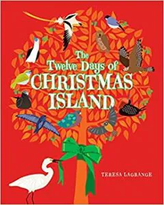
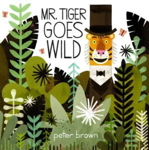
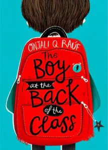
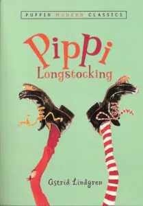
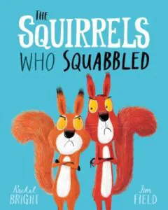
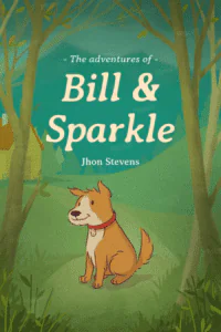
Based on your age group research, find out what types of images, illustrations, and ornaments, your readers will not walk past. Use that knowledge to turn pictures into an attention-grabbing and appealing visual element of your design. In the book art for kids, most of the time, the win-win situation would be to turn the image into your central design element.



To sum up
Hope we managed to steer some light on the children’s book cover design ideas. All you have to do is hint that your book cover will open the door to the adventures of a lifetime.
Which of the joyful book art did you like the most?
Let us know in the comments section below.


