


“How to design a movie poster?” is a loaded question that calls for a deep understanding of graphic design and the movie industry.
But, we’ll do this question one better: How to design an effective movie poster? Now, that’s a real puzzle, which, unfortunately, doesn’t have any clear-cut solutions. What we can give you though are the breadcrumbs: marketing and movie poster design tips, tricks, and examples that will help you create a poster that does your movie justice.
What makes an effective indie movie poster design?
Understanding is a foundation of an effective movie poster design.
Let’s explain.
A movie poster is a hook the goal of which is to seduce a viewer into clicking the right link, saving the poster into their folder “watch later”, or researching more about your indie flick. It means you need to understand who your viewer is and how you can interest them.
Yes, great art can be created on impulse, in blind fervor without understanding why and for whom you’re creating it. We can’t say the same about a movie poster design because it’s, first of all, a marketing tool.
Movie poster created by Getcovers
We don’t want to suck all the fun and life out of movie poster creation. On the contrary, there’s a lot of fun to experience creating the posters. But you need to incorporate research and planning to design a movie poster that works (which can also be a lot of fun).
So, we propose three questions the answers to which will help you to design a fine poster — the 3 W:
- Who is your movie for? (In other words, what is your niche?)
- Why does your movie appeal to them? (Is it a relatable character, an interesting visual style, or a setting?)
- What makes your movie stand out from the competition? (Your unique selling point: Is it director, cast, an interesting mish-mash of genres, glowing reviews?)
Of course, indie movie marketing research is much more complex than that. But in case of tight budgets, deadlines, and resources, this framework gives you a nice foundation for an effective movie poster design.
Now that you have this vital understanding, you can move on to the second most important aspect of how to design a movie poster — actual design.
How to design a movie poster: top movie poster design tips
To design a movie poster is to build a complex mechanism with a lot of moving parts that need to be well-oiled and precise to work well together. So, here are movie poster design tips that will help you keep everything up to the standards.
Movie poster concept tips
To know how to design a movie poster, you need to know how to approach the poster concept first.
Ideally, a movie poster concept should reflect the answers to the aforementioned 3 W:
- Your film’s niche;
- Your film’s appeal;
- Your film’s USP.
It’s motivating: With such an approach, you have clear directions.
So, at this point, you should have ideas of what you want to depict on your poster.
- Should the poster be more character-focused or setting-focused?
- Should the poster be minimalist or overflowing with details?
- Should it include scenes from the film, clear visual storytelling, or paint a more abstract picture?
You know the preferences of your viewers and the strengths of your film, so play to them.
And next, regardless of whether you work alone or with a professional movie poster designer, we suggest finding references. They will help give definite shape to your ideas and provide a designer with visual guidelines.
When looking for references, don’t limit yourself to movie posters alone. You can also check book cover design, album art, illustrations, and whichever visual you find relevant and useful.
Movie poster visual storytelling tips
With a poster concept at hand, you can get to crafting visuals.
It’d be great if a viewer could discern at least one of the following when looking at your indie movie poster design:
- Movie’s genre;
- Movie’s theme;
- Movie’s setting;
- Movie’s conflict;
- Movie’s premise;
- Movie’s message.
A great example of the poster that masterfully tells a viewer a lot of the aforementioned with little is Midsommar — a horror movie directed by Ari Aster.
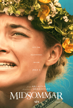
- The ethnic elements on the poster show the setting — a North European community that is close to its roots.
- The distressed/terrified/devastated face of the character strongly hints at the uncanny elements of the movie.
- The seemingly upbeat tagline — “Let the festivities begin” — is in harmony with the bright imagery and in the tense contrast with the woman’s emotions. Folk festivities sure sound like a lot of fun, but in this particular case, we’d rather pass.
The poster also doesn’t look like your typical horror movie poster because A24 and Ary Aster aren’t known for making typical horror movies. Their fans are used to a more avant-garde style of the studio’s pictures, and the poster reflects it.
If you want a unique horror movie that doesn’t shy away from unfamiliar aesthetics and approaches, you’ll definitely notice Midsommar’s poster.
Movie poster design elements
Next, you want to choose which movie poster design elements you want to include. Overall, a movie poster can have the following elements:
- Title;
- Tagline — a motto/slogan of the movie;
- Logotypes — a symbol of a movie or studio;
- Name of a director;
- Names of actors and actresses;
- Studio name;
- Theatrical release date;
- Nominations and awards movie received;
- Prominent quotes from reviews;
- Age restriction;
- Related movies — other films by the same director or studio and movies starring the same actors;
- Contacts — film website, address,
You don’t want to overload your movie poster design elements, so pick the most beneficial ones. Most often, indie filmmakers include title, tagline, director’s name, awards, cast, and studio.
Usually, the title is the most prominent element, followed by tagline or important awards. The names of director, studios, or cast are next in line, taking enough space to be readable but not fighting for viewer’s attention. The rest of additional info, if any, is barely legible.
Movie poster created by Getcovers
Also, it’s better to plan movie poster design elements inclusion around artwork and not vice versa.
With two exceptions though:
Title and Tagline.
This duo is particularly important as title and tagline are an intrinsic part of the design: They can change a viewer’s perception of the movie poster’s visual storytelling. (And vice versa like we demonstrated with the Midsommar poster.)
So
Remember to account for how the title and tagline interact with the movie poster graphic design.
Indie Movie Poster Typography Tips
Typography can make or break the artwork. So, understanding typography is essential to understanding how to design a movie poster
Great typography should feel like an integral part of your movie poster graphic design. It means that the font, text’s color, texture, positioning, and customization should fit the rest of the visuals like a glove.
Design by Getcovers
We can’t give you any clear-cut rules for successful movie poster typography as they don’t exist. Each case calls for something new. But a few general typography customization tips can help:
- Mixed case letters are the most readable;
- Letters in bold show power;
- Slanted letters convey a sense of movement;
- Straight letters refer to stability;
- Fonts with fewer embellishments feel comforting and chic. Use them for the impression of elegance, strict confidence, or authority;
- Fonts with more ornaments speak creativity. Use them if your want the text to seem loud, expressive;
- Use broad or narrow letter spacing to communicate airiness or the anxiety of confined space.
Keep in mind that the typography choice depends on the movie genre, for example:
- Large and bold fonts, like Arial, Helvetica, Gotham and Futura, are suitable for comedy titles.
- Horror movies tend to have serif fonts or combination of serif and non-serif one.
- Glowy typography is a perfect match for science fiction.
- Romance movies most likely contain elegant fonts with a lot of curls.
Movie poster design also gives a possibility to place text unconventionally. Depending on the features of the composition, you can place the title not only horizontally, but also vertically or diagonally.
Often, picking typography for the movie poster graphic design comes down to experimenting and seeing what sticks the best. Ideally, you want a professional movie poster designer to help you out.
Indie Movie Poster Color Tips
When deciding on the color scheme for your movie poster graphic design, your gut instinct might be to follow the color trends of the industry
It seems safe and easy, but that’s a precarious road for an indie film
Trends are created and reinforced by big players that try their damnedest to cater to the widest audience possible. So, they often stick to the safe and familiar, which cheapens its impact.
For example, contrasting red or orange against blue is often used to communicate duality and conflict. Just take a look at these posters of three very different movies.


It creates a peculiar feeling as if Godzilla could help Ryan Gosling’s character to untangle the mysteries of his dystopian world. And it definitely sounds like a fun watch, but we doubt it was an intended association.
On the other hand, your indie movie caters to a very specific niche. So, your colorwork should reflect your movie’s appeal. In other words, you have more creative freedom as you shouldn’t walk the precarious tightrope of mass appeal.
Your primary task is to ensure that colors suit the tone of your movie. The poster shouldn’t have a similar color grading per se, but the hues should send a similar emotional message.
In other words, the colors should reflect the promise of your movie, whether it’s: you’d be scared, sad, enthusiastic, retrospective, enraged…
Design by Getcovers
INDIE MOVIE POSTER EXAMPLES
Let’s see how all these tips work in practice looking at book cover examples designed by the Getcover team.
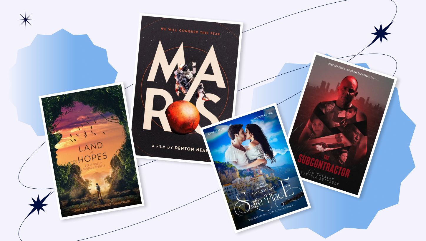
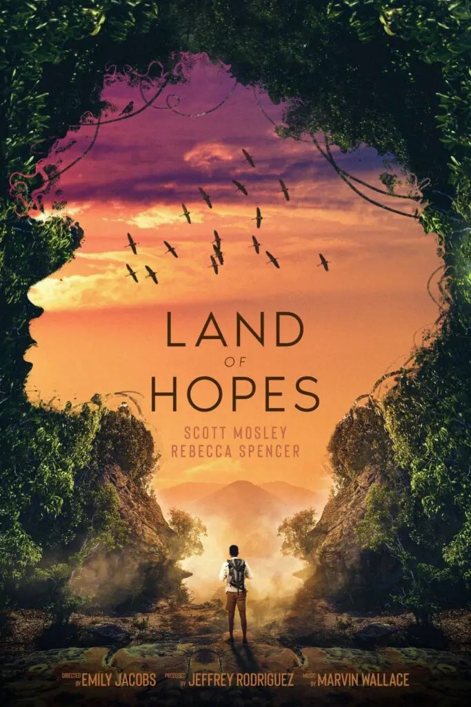
How to create an adventure movie poster?
The main character stands in the center with his back welcoming readers to join his adventure. We can look in the same direction with the protagonist. He has a backpack on his shoulders: Such a bag is always associated with traveling and overcoming obstacles.
Green leafy trees, bushes and lianas frame the main character beautifully. Nature also forms a gorgeous woman’s silhouette hinting at love adventure too.
Designers used bright and natural colors for this movie poster. A simple sans serif font suits this genre perfectly attracting the readers’ attention to the title and film creators’ names.
Design by Getcovers
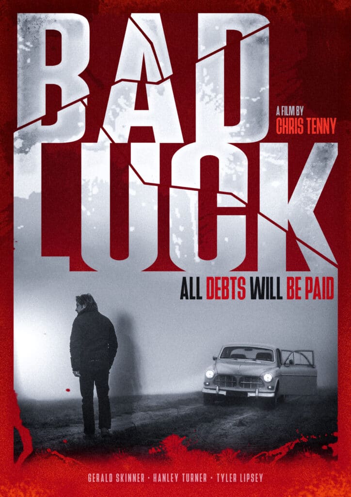
How to create an action and thriller movie poster?
Viewers can see the main characters in the center of the composition. There are metropolis skyscrapers in the background hinting that movie events take place in a big modern city.
The images of other characters against the protagonist mean that these people are connected and influence each other’s lives. The entire movie poster is made in red tones as it’s a color of power, anger, action and danger. We chose a large sans serif font and red hue for the title to catch maximum attention.
There is also a movie slogan on the top setting the tone of the whole story.
![]()
Design by Getcovers
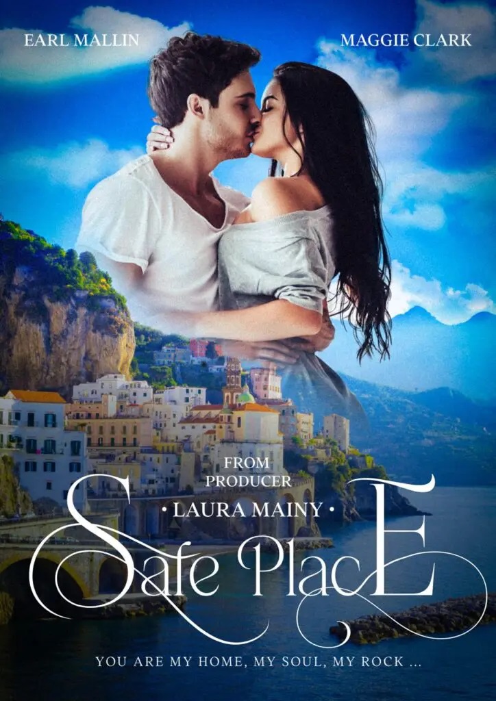
How to create a romance movie poster?
A traditional romance movie poster contains a couple of lovers kissing, hugging or laughing happily in the center of composition. In the background, viewers can enjoy a picturesque scenery of the place where the movie events take place.
Bright blue colors of the sky highlight the cheerful and positive mood of the movie. An elegant serif font with large curls for the title suits the love story perfectly.
Design by Getcovers
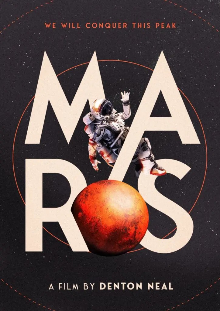
How to create a science fiction movie poster?
A space adventure is a popular theme for science fiction movies. So we used a space with distant stars and universes as a background for the entire composition. A large bold serif font in white draws attention to the title. An image of the Planet Mars complements the composition.
Also, there is an astronaut levitating in space in the center of the movie poster. We combined texts and objects together to create a 3D effect. A movie slogan is made in red to harmonize with other red elements.
Design by Getcovers
How to create a horror movie poster?
The combination of black and red colors is perfect for horror movie posters as these hues symbolize darkness, power, anger, death, and fear. However the background is a bit lighter than the main elements to draw attention to the character and the title by contrast.
The dark heroine is looking directly into the viewers’ eyes creating an intimidating effect.
For this movie poster, we use two fonts: Red serif font for the main word, and beautiful white cursive for slogan and sub words.
![]()
Design by Getcovers
And finally
To design a good movie poster is to take a hundred steps, each one with consideration and understanding of why you’re taking it. It’s a tough process that takes a lot of mental effort, planning, and trying on top of marketing and graphic design knowledge.
If you feel like you need help from an experienced movie poster designer to help your indie movie marketing efforts, feel free to contact us.


