


“God is the one who causes fortune; the wise man is the one who causes savings.”
It’s a quote from Insinger Papyrus, a 2200-year old Egyptian Sebayt writing, a wisdom literature focused on the “way of living truly.” Yes, it is one of the most ancient examples of self-help literature.
The Papyrus is a testament to the enduring relevance of self-help books. In ancient times, only the lucky ones could create such literature. Nowadays, anyone with a strong desire and writing skills can present their work to the world.
As a result, “the number of published self-help books even outpaced the growth of sales.”
How to stand out in this crowd? Start with an outstanding self-help book cover design.
We have analyzed recent self-help bestsellers to give you the best tips on how to create a book cover that will build trust and make people buy your book.
Let’s start.
Avoid cliches in self-help book cover design
Self-improvement texts have their cliches like “follow your dreams,” “visualize success,” “early bird gets the worm,” etc. and so do the covers. We mean the cliche imagery that is often associated with success, achievement, harmony, etc.
A bright (like direct sunlight in the morning) example is a person atop of a mountain, throwing their hands into the air.
Unless your book is about getting to the top of a mountain and enjoying your achievement by assuming a victorious pose, put on your cover something else. The same about jumping people.
Cliches work like audience detergents. Readers have seen so much of such imagery, that their minds simply don’t register the covers.
If you are absolutely sure that the visual cliche will attract your audience, feel free to go all in. But, if you have any doubts, better reconsider.
Use color as a main book cover tool
Some self-help books’ covers focus solely on color. The design of such self-help bestsellers can be roughly divided into two groups.
The first one does not hold back. These covers are a bright explosion of complementary colors, a saturated expression of emotion.


They attract attention, no doubt. However, be careful when creating such self-help covers. You should know why you choose certain colors, what emotions they evoke, and whether they suit your subgenre. In the mentioned examples,
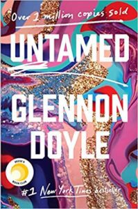
- Untamed is about how women can find joy and harmony when defying the need to meet people’s expectations. The cover makes perfect sense — a powerful combination of tender, glittering, calm and energetic colors — a representation of how multi-sided modern women are.
- The cover of How to Do the Work combines orange, yellow, red, and a little bit of pink, which are youthful, energetic colors; they are living fire — a great choice for a book about healing and overcoming the consequences of trauma.
- The colors of Gravity of Joy are ecstatic and fun.
Also, notice that the text in both cases is gigantic and absolutely dominates the cover. It’s a conscious choice as it helps to create a focal point and deliver the message despite the whirlwind of colors.
One advice, if you choose to go this route, make sure that typography is immaculate:
- Suitable fonts that are customized if required
- No more than two different fonts (one for the title, the other for author’s name, or one font for both)
- Proper size (not too big, not too small, doesn’t clutter the title)
- Proper size differentiation (title is bigger than the author’s name unless the author is popular)
- Intuitive layout
- Has a fitting color or texture if required
The second group of self-help books uses a single dominating color and, maybe, some ornamentation.


Again, the color selection comes down to the message you want to send and the audience to target.
A photo-based self-help book cover
If you have a substantial following, slapping your photo on the self-help book cover is an optimal solution. There is plenty of improvement literature with all sorts of influencers, celebrities, and sportspeople on the covers.


If you don’t have a fanbase per se, photo-based cover isn’t the best solution. People who don’t know you will assume that a person on the cover is known, but not to them, so they will likely ignore the book.
A minimalistic conceptual book cover
Perhaps, the most popular approach to self-help literature is a cover with a simple but conceptual image/photo/doodle that suits the title and/or theme of the book.


Though, don’t think that such art is easy to execute. You should tie both imagery and composition to the content of your book. So ensure that:
- There is a clear focal point
- The imagery and typography are in harmony with one another
- The colors are on point
- The genre of your book is apparent
Creative hand-crafted illustration for a self-help book cover
Have you seen self-help book covers with hand-drawn illustration? And we don’t mean vector-based humans so popular for corporate use, but custom art with its character.
Such books exist, but they are very few and far in between. For some reason, illustration is not a popular approach for the self-improvement/happiness genre. And it’s strange because hand-crafted paintings are warm, fuzzy, and unique.


Considering the saturation of the market, it’s quite possible that we’ll see even more of the self-help books with illustrated covers in the future.
And maybe your book will be one of them.
Summing Up
Self-help books industry is a big place, and it’s quite difficult to get noticed there with writing alone. A cover can become your marketing tool and help you promote your book.
Who knows, maybe your self-help book will persist through ages just like Insinger Papyrus, and people of the future will cherish not only its content but a beautiful cover too. In any case, remember the canons of the book cover design, always look for inspiration and feel free to experiment!
What do you think makes a catchy self-help book cover?


