


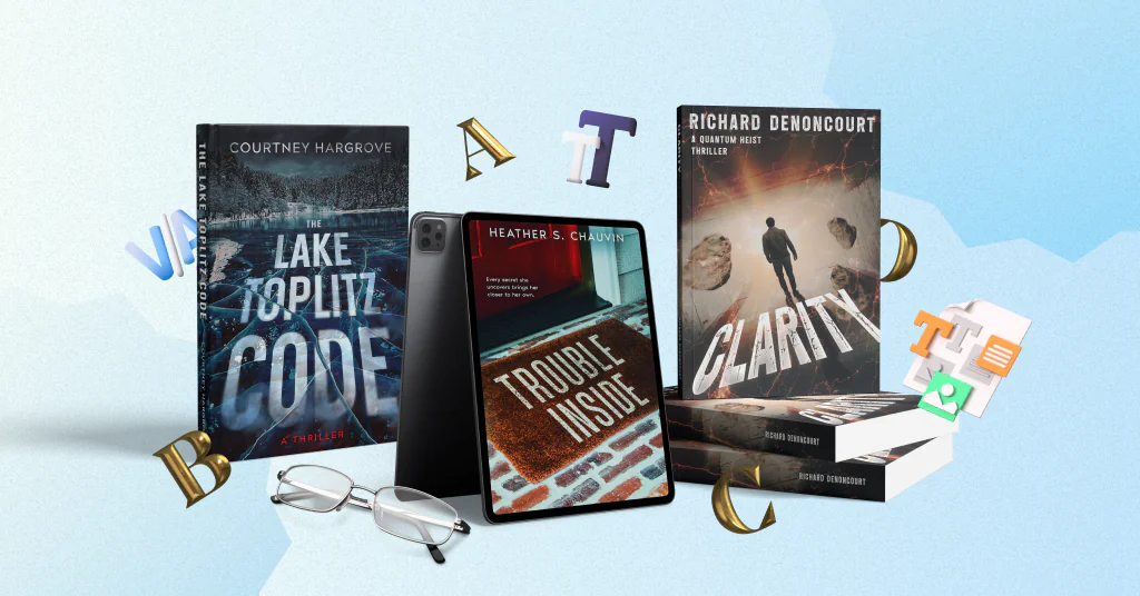

Typography is one of the first things readers notice on a book cover. It shows the title and author’s name, but it can do more. The right font, placement, and effects can hint at genre and mood.
Typography can also become part of the image, connect with key objects, or add movement to the design. Still, creative typography should stay clear. Readers need to read the title fast, especially as a small thumbnail.
Here are six ways to make book cover typography stand out while keeping it readable.
1. Turn typography into part of the cover concept
One of the strongest ways to use typography is to connect it directly to the title or story. Instead of placing plain text over an image, the designer can turn the letters into an object or material.
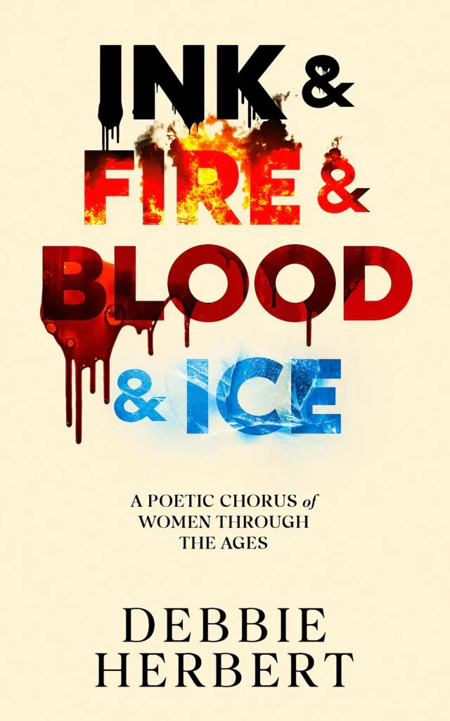
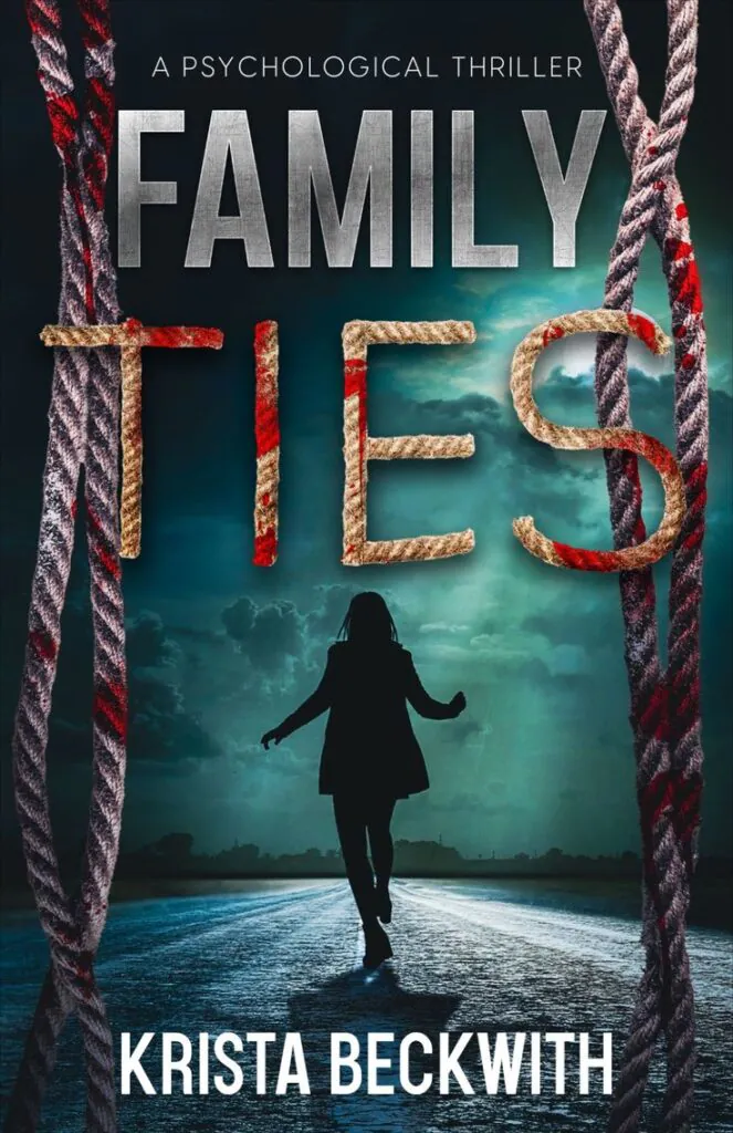
On the cover of Ink & Fire & Blood & Ice, every main word has a different texture. “Ink” looks dark and wet. “Fire” contains flames. “Blood” has red drips, while “Ice” has a cold blue surface. Family Ties uses a similar idea. The word “Ties” is made from rope. More ropes appear along the sides of the cover and connect the title with the rest of the composition.
 |
 |
Book cover design by Getcovers
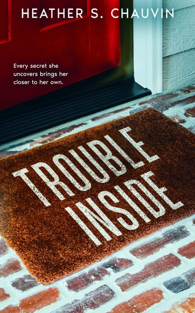
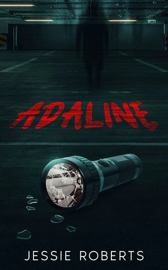
Typography can also become part of a real object or surface. In Trouble Inside, the title appears on a doormat in front of a closed door. This placement makes the word “Inside” more important and suggests that something is waiting behind the door. The title of Adaline looks like a red message written on the floor of a dark parking area. The rough texture matches the tense setting and directs attention to the broken flashlight.
 |
 |
Book cover design by Getcovers
This approach works best when there is a clear connection between the typography and the book. An effect should support the title, setting, or main idea. It should not be added only to make the letters look unusual.
2. Let objects interact with the letters
Text and imagery do not need to stay in separate parts of the cover. Objects can pass in front of the title, behind it, or through the letters. This creates depth and makes the typography feel like part of the full composition.
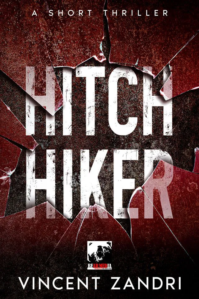
In Hitch Hiker, cracks from broken glass pass through the large white letters. The title looks damaged together with the background. The effect supports the thriller genre, but the words remain clear because the letters are large and have strong contrast.
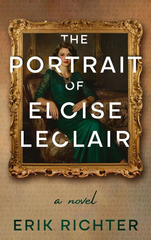
In The Portrait of Elise LeClair, the title is placed directly over a painted portrait. The woman’s face and body remain visible between the lines of text. The clean white letters also create an interesting contrast with the detailed painting and gold frame.
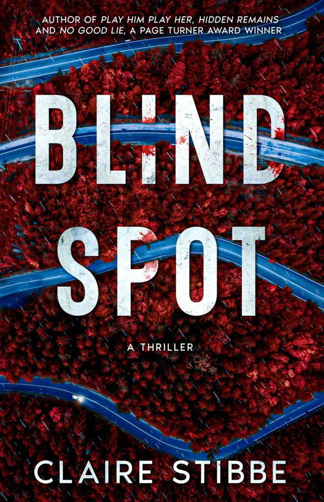
Blind Spot uses massive words that cover much of the forest. The roads move between the letters and remain visible around them. The title partly hides the background, which also supports the idea of a blind spot.
 |
 |
 |
Book cover design by Getcovers
When objects interact with typography, they should not cover the most important parts of the letters. Readers should still be able to understand every word without guessing.
3. Blend typography with the background
Typography can stand out without looking separate from the artwork. A font can use the same colors, textures, shapes, or style as the background.
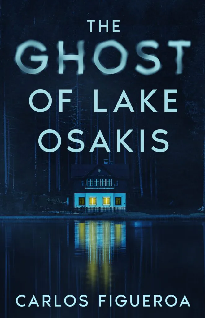
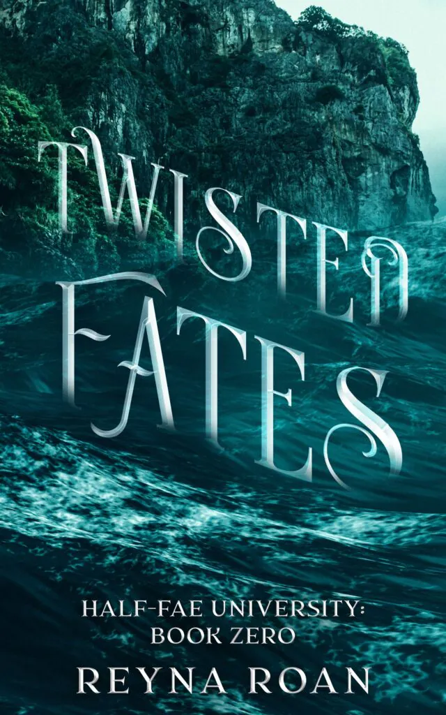
On The Ghost of Lake Osakis, the thin blue letters match the dark lake and its reflection. The soft glow around the title supports the quiet, mysterious atmosphere of the scene. The title of Twisted Fates uses long decorative letters that follow the shapes of the waves. The typography looks affected by the same movement as the water around it.
 |
 |
Book cover design by Getcovers
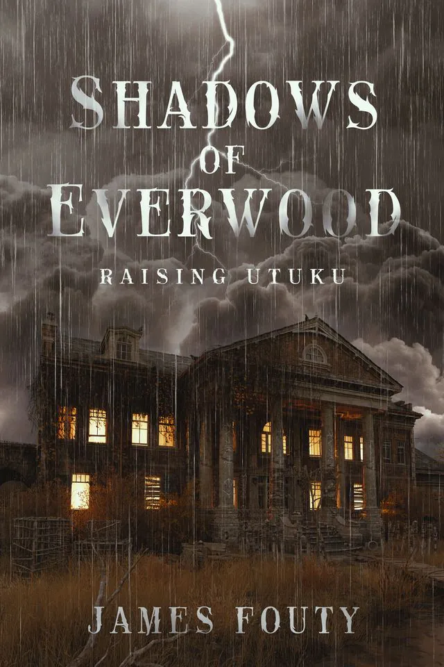
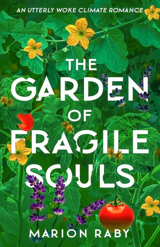
In Shadows of Everwood, the pale serif letters match the old house, rain, and stormy sky. The font has a slightly aged look, while the lightning supports the vertical structure of the title. The Garden of Fragile Souls takes a different approach. The white title is simple and bold, while the background is full of leaves, flowers, and fruit. The clean letters bring order to the detailed image. At the same time, the plants surround the words closely, so the typography remains part of the garden.
 |
 |
Book cover design by Getcovers
Blending typography with the background does not mean making it hard to see. The title still needs enough contrast. It should feel connected to the artwork without disappearing into it.
4. Use effects that match the genre
Typography effects can quickly show readers what kind of story they can expect. Rough textures, cracks, drips, light, blur, and distortion all create different moods. The most important rule is to choose effects that fit the genre.
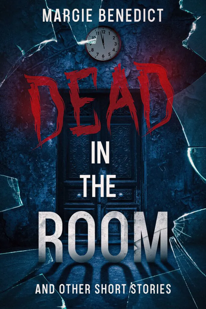
On Dead in the Room, the word “Dead” is large, red, and rough. It is very different from the narrow white letters used for the other words. This contrast creates a clear focal point and supports the darker tone of the collection.
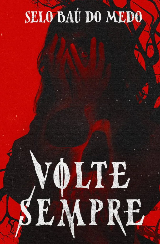
The white typography on Volte Sempre has sharp and uneven forms. It matches the red-and-black illustration and creates an unsettling mood.
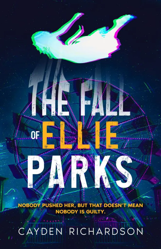
The Fall of Ellie Parks uses a colorful glitch effect around the falling figure and parts of the title. The shifted colors suggest confusion and movement. The yellow word “Ellie” also helps readers find the most important part of the long title.
 |
 |
 |
Book cover design by Getcovers
Effects should enhance the cover’s message. A thriller may benefit from damaged or rough letters. Fantasy can use light, smoke, or unusual letter shapes. A softer story may need a cleaner or more handmade style. Avoid using several strong effects at the same time. One clear idea is usually more effective than many competing details.
5. Experiment with placement and font combinations
Creative typography is not only about choosing an unusual font. The placement of words and how different fonts work together can also make the design more memorable.
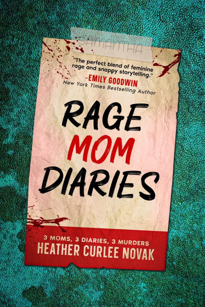
On Rage Mom Diaries, the title appears on a page inside the main cover. The handwritten font supports the diary format, while the red word “Mom” creates a clear accent.
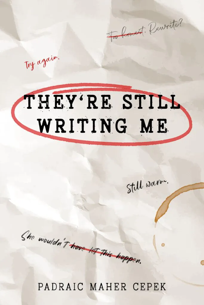
They’re Still Writing Me combines a typewriter-style title with handwritten notes, crossed-out phrases, and red corrections. These small details make the cover look like a page that is still being edited. They support the main idea without hiding the title.
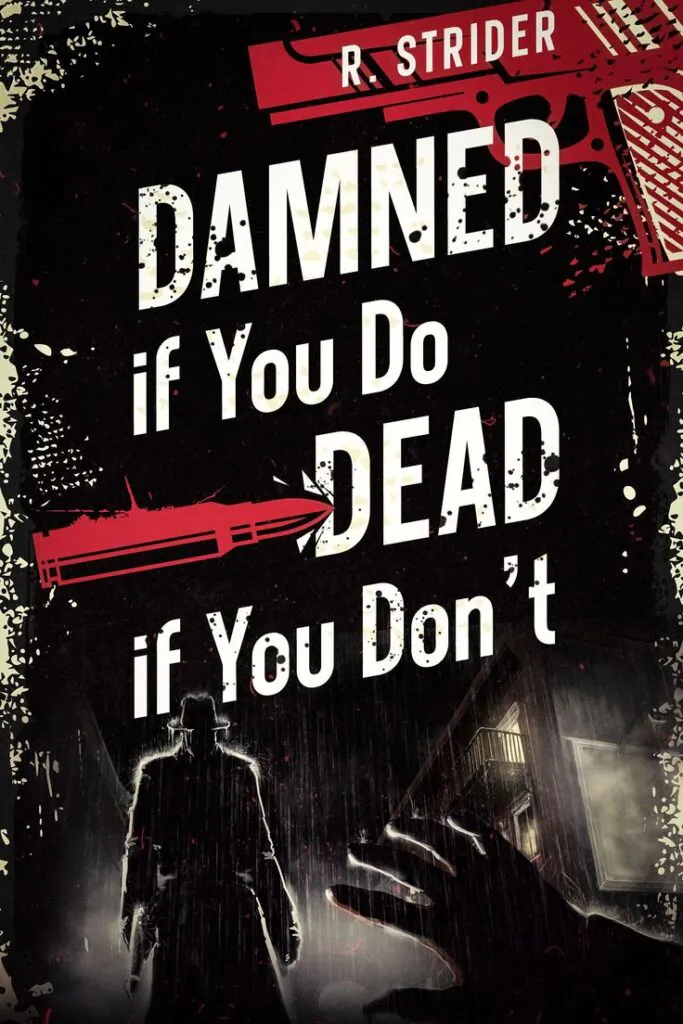
The long title of Damned if You Do, Dead if You Don’t is divided into several blocks. The words have different sizes and angles, but the reading order remains clear. The uneven placement also matches the crime-inspired design.
 |
 |
 |
Book cover design by Getcovers
When combining fonts, give each one a clear role. One font can be used for the main title, while another can be used for a smaller phrase, subtitle, or accent. Using too many fonts can make the cover difficult to understand. In most cases, one main font and one supporting font are enough.
6. Add movement through perspective and letter position
Typography can create movement even when the main image is still. Designers can use angles, changes in size, uneven letter positions, and perspective.
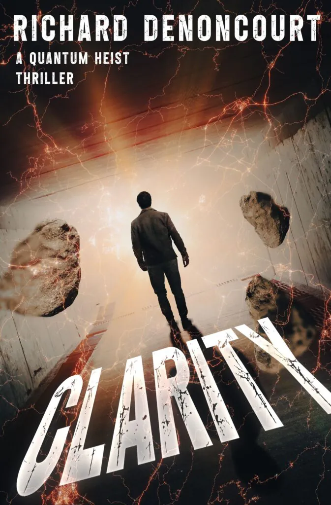
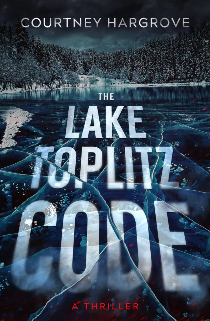
The title of Clarity also uses strong perspective. The word becomes much larger near the bottom and appears to lie on the floor in front of the character. Its angle supports the scene’s direction. In The Lake Toplitz Code, the title follows the surface of the frozen lake. The words grow larger toward the reader, while cracks and ice details remain visible through the letters. This makes the text part of the landscape.
 |
 |
Book cover design by Getcovers
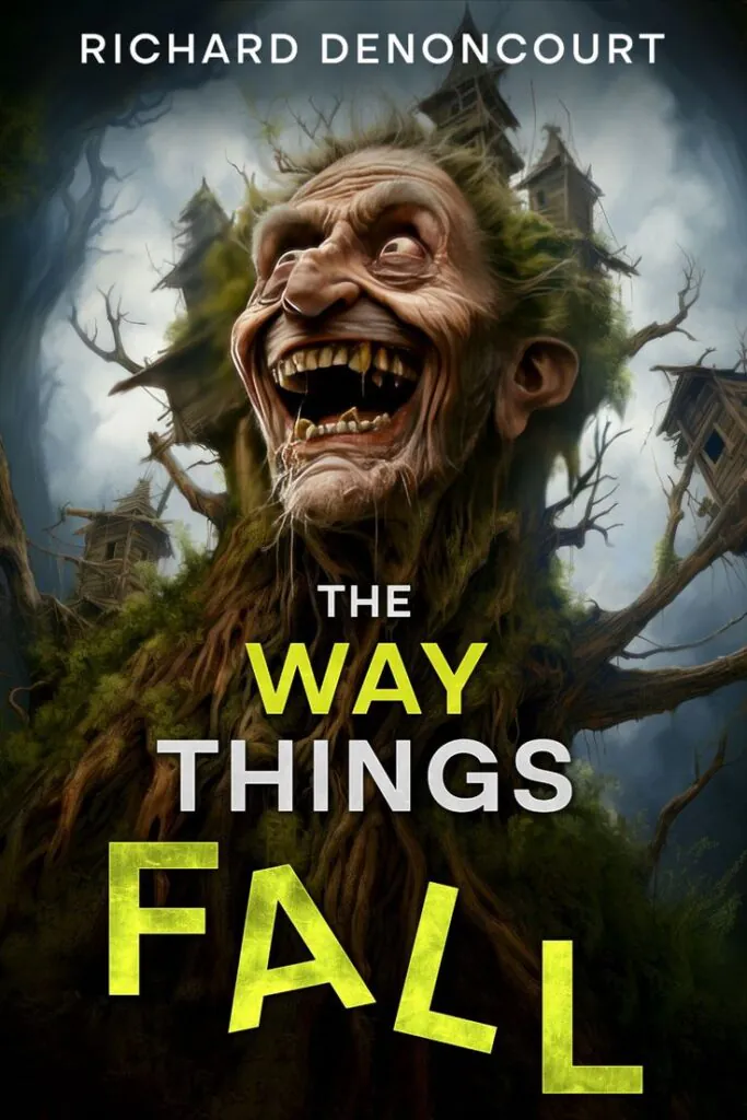
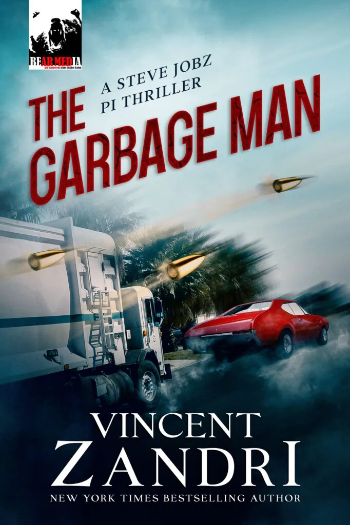
The Way Things Fall creates movement through the position of individual letters. The letters in “Fall” sit at different angles and heights. They look as if they are losing balance and falling down. On The Garbage Man, the title is placed at an angle that matches the moving car and road. The narrow red letters support the feeling of speed and action.
 |
 |
Book cover design by Getcovers
Movement should still be controlled. A strong angle or unusual perspective can attract attention, but the title needs to remain readable. Readers should understand the words before they notice the effect.
To wrap up
Interesting typography still has one main job: to help readers read the title. Always check how the cover looks as a small thumbnail. This is often the first version readers see on Amazon, social media, or another online platform.
Before approving the typography, check whether:
- Title is easy to read at a small size;
- Text has enough contrast with the background;
- Reading order is clear;
- Objects and effects do not hide important parts of the letters;
- Author’s name does not compete with the title;
- Style matches the book’s genre;
- Main idea still works when small details are no longer visible.
Which creative typography example was your favorite? Tell us in the comments on this post. Let’s talk about it.


