


Ready to unlock the secrets to fantastic nonfiction book cover design?
While your nonfiction book provides your readers with valuable or even life-changing information, a wrong book cover design can turn potential readers away.
Intimidated? Don’t be. We’ve put together a guide with 9 powerful nonfiction book cover design tips to help you expand your loyal readership and boost book sales.
Keep reading, and find out how to:
- Use colors to draw attention to your nonfiction book cover
- Add text to appeal to your target audience
- Use typography to hook more readers
- And so much more
It’s nonfiction time!
Nonfiction book cover design tips
Check out these 9 mind-blowing tips on how to improve your nonfiction book cover design.
Are you also searching for some inspiration for nonfiction book cover design? Well, look no further. We are going to showcase some excellent nonfiction book covers.
Game on!
Tip 1: Align with genre expectations
When designing a nonfiction book cover, it’s not just about creating something beautiful, like usually with a fiction book, but something familiar enough that readers instantly understand what kind of book they’re looking at. Each nonfiction genre has visual cues that signal to readers, “Yes, this book is for you.”
- Business and marketing books often feature bold, minimalistic layouts with sharp typography and confident color palettes. This clean style communicates authority and professionalism.
- Self‑help or wellness books tend to use softer colors, uplifting imagery, and friendly fonts to evoke encouragement, growth, and positivity.
- Memoirs usually carry a personal touch, such as a striking portrait or a symbolic object, that hints at the life story within.
- Historical nonfiction often leans into rich, classic tones and elegant serif fonts that suggest depth and gravitas.
Understanding these genre-specific signals helps you meet your audience’s expectations while still leaving room for a unique twist. When readers see your cover and think, “Ah, this feels exactly like the kind of book I want,” you know you’ve nailed it.


Tip 2: Use colors to draw attention
The main function of your nonfiction book cover design is to appeal to potential readers mentally. You need to activate the subconscious triggers that will signal your readership that the book they’re looking at will teach them valuable lessons. That’s why you should not underestimate the power of color theory.
- There’s a reason why many thought-provoking nonfiction titles use orange as their dominant color. According to color theory and psychology, orange color evokes the pursuit of achievement and self-affirmation.
- However, if you’d like to try something different, yellow, orange, blue, and red color combinations are a go-to in nonfiction book cover design.
- The best background color solution might be gray, white, or black as they symbolize simplicity, balance, and wisdom.
Can you take your eyes off these gorgeous colors on nonfiction book covers?


Tip 3: Value the white space
One of the common misconceptions about the nonfiction cover design is that some authors believe they need to use all the space available on the front cover to make it better. Wrong! Don’t be afraid of white space – parts of the book cover that don’t have images, texts, or graphic elements.
- When it comes to nonfiction, your design doesn’t need to be bright, loud, and overly decorated. Otherwise, you risk drawing the potential readers away. They might consider the cover design too overwhelming if there’s a lack of white space.
- Moreover, white space allows you to highlight what is important. For example, your main visual element, a subtitle, or a review. It improves the readers’ perception and allows them to quickly scan the cover and decode the message you’re trying to send.
Here are some perfect examples of how white space matters in nonfiction book cover design.


Tip 4: Add text to appeal to your target audience
Now, here’s a fundamental difference between fantasy or thriller and nonfiction book cover design. When working on a design for fiction titles, designers tend to avoid all the unnecessary text on the front cover, except the title and the author’s name. Guess what?
For your nonfiction cover design, you absolutely should consider planting more text. Just try to put yourself in your readers’ shoes for a moment. You’re in the bookshop; you grab a book; the title shouts “success”. Is there something missing? Well, of course!
- It would be best if you elaborated on what exactly the nonfiction book is about. To achieve that task without appearing too pushy, you might consider adding a teaser, review, bullet list, subtitle, or a puff quote. This trick will help you to, first, establish social proof and also give your readers a decent reason to pick your book.
- You’ll also leave the impression of being straightforward if you add some text on the cover. It’s as if you were indicating that you have nothing to hide and want to provide your readers with value without wasting their time. Isn’t that exactly how you’d like to appear?
Does the text on these book covers pique your interest?


Tip 5: Follow the rule “less is more” when choosing images
Trust us when we say it: the best idea for your nonfiction book cover design is a smart and rational approach. Don’t place many absurd images and illustrations since you’d be risking confusing the reader. Think about it: if you didn’t manage to arrange the pictures on your book cover, where’s the proof that you are able to organize your thoughts in the book itself?
- We’d recommend choosing one central image to hook the readers and give them some food for thought.
- Don’t be afraid that, due to the lack of images, your design will look dull. Use solid colors and strong fonts to create balance, and pop your image as necessary. Value quality over quantity, and you’ll be good to go.
- Keep in mind that it might be best to avoid using highly rated stock photos because your book cover might not seem unique. Think for a moment, how many light bulbs have you already stumbled across in nonfiction book cover design?
Now, let’s match words to pictures. Check out these attention-grabbing minimalist book covers.


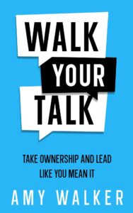
Tip 6: Use typography to hook more readers
It might come as a surprise, but typography is the most important element in your nonfiction book cover design. Most probably, your book covers a topic that defies figurative expression. Therefore, the font will often become the leading, and sometimes the only means of design.
- Feature keywords on your nonfiction book cover design that will throw some light on the topic you’re writing about. A great trick is to use a different font color for your keywords to grasp the reader’s attention immediately.
- Pay attention to word clutter when it comes to typography on your nonfiction book cover design. Remember: Readability comes first.
- Keep in mind the visual hierarchy when choosing the typography. Experiment with font size, but don’t forget about the logic.
- Some book cover designers swear by combining two different fonts on the nonfiction book cover design. It helps to add an extra hook and leaves more space for creativity.
Now, it’s showtime! Can this typography in nonfiction book cover design get any better?


Tip 7: Consider a photo-less design
Sometimes all you need to create an appealing nonfiction book cover is colors and fonts. What about the images? Well, there’s nothing wrong with tossing them out.
- Unless you’re describing your own success story, avoid using photos of people and celebrities. Such a design style is considered to be outdated and may appear bland.
- Consider replacing the photos with illustrations. It helps in adding a unique vibe to your book cover design.
- Since your nonfiction book cover might be featuring a lot of text elements, adding photos might overcramp the overall design. Aim for the balance, and add a picture only if it’s indispensable.
It’s time for our book cover design runway show! Get your front row seats!
Which one of these captured your attention immediately?


Tip 8: Avoid cliches
Surprisingly enough, there are a lot of clichés when it comes to nonfiction book cover design. Readers themselves form and prove those clichés, simply because the consumer tends to react and relate to familiar things. Try to think outside the box, and follow the design trends rather than clichés.
Many authors fall into the trap of thinking that nonfiction book cover design doesn’t require much effort, unlike romance or other fiction stories. Some use DIY book cover makers and end up with clichéd templates that are too predictable and lack a distinguishing feature.
So be creative and experiment! Here are a few unique examples to inspire you.


Tip 9: Make it fun and age‑appropriate for children’s nonfiction
Children’s books are one of the popular nonfiction categories, too. Designing such covers for kids is all about balancing information with excitement. A child’s first impression comes from visuals, so your cover should immediately spark curiosity and feel welcoming for their age group.
- Use bright and energetic colors that stand out and feel lively. Think sunny yellows, bold blues, and cheerful greens that capture attention in an instant.
- Choose playful, easy‑to‑read fonts with clear letterforms, so even younger readers can recognize the title at a glance.
- Incorporate engaging illustrations or characters that hint at the topic and make learning feel like an adventure.
- Match the style to the age group. Simple shapes and bold images work best for younger kids, while older readers might enjoy more detailed, realistic artwork.
When a child looks at your cover at the bookstore and feels excited to open the book, you’ve created a design that not only informs but also delights.


Final thoughts
To sum up, there’s so much more to your nonfiction book cover design than just images, colors, and fonts. Consider your options carefully since your main goal is to capture the readers’ attention from a mental perspective. Don’t get too emotional, stay rational, and follow our nonfiction book cover design tips.
Which nonfiction book cover designs inspired you the most? Do you have any other questions? Reach out to us!


